There are many ways to approach the typographic page, this site focuses on three: Classical, Modernist, and Post-Modernist. The typographic page changed as the content, audience, role of the designer, and available technology changed.
The Classical typographic page developed from the old methods of book-making: first in scriptoriums, written by hand, and later with the advent of the printing press. The Modernist page grew out of a fascination with industrialization and a desire for order after years of living through the chaos of World War I. The Post-Modernist page was influenced by both the Deconstructionist movement and the advent of the personal computer. Suddenly, designers could take apart and re-build texts in the comfort of their own studios.
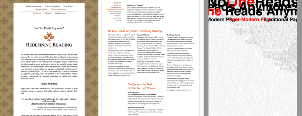
Three general approaches to the typographic page. Left: a Classical page by Rich Leonardo feels “old.” Middle: a Modernist page by Chris Nelson is designed to guide the reader’s eye from section to section. Right: A Post-Modernist page by Sara Richards responds to the question “No one reads anymore?” creating an unreadable visual texture.
Classical, Modernist, and Post-Modernist typographers had different ideas about how people read and designed their pages accordingly.
Beyond the bounds of these three historical styles is contemporary practice. Contemporary typographers combine formal and theoretical elements from Classical, Modernist, and Post-Modernist typography. It is neither necessary nor practical to completely separate the three approaches.
Characteristics of Classical Pages
Classical Pages Used a Text Frame
In a classical page, text lives in a block, framed by generous margins. Deviations on this form can include using two columns of text within the frame, filling the margins with blocks of text, filling the margins with a detailed border, and interlocking blocks of text in a complex system within the frame.
Text frames came into use in the Middle Ages when the codex (manuscript book) replaced the scroll for written media. Scribes scored vertical and horizontal lines on the vellum pages, thus creating the first text frames.
Early printers used a similar layout.
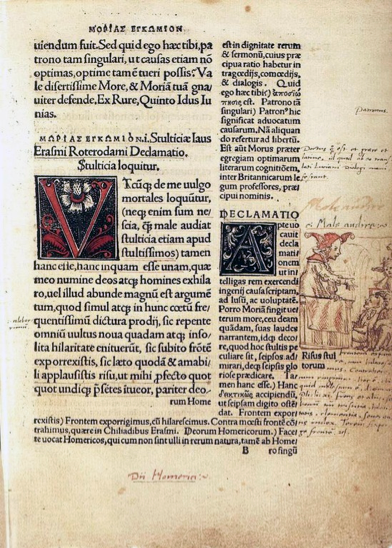
From “The Praise of Folly” by Erasme. Printed by Johann Froben (Basel, 1515). Commentary on the text is set in the right-hand column. Both the main text and the commentary fit within the text frame.
While there is no “rule” against it, most websites don’t use a text to frame structure—they use as much of the screen as possible.

The Society of Typographic Aficionados (SOTA) uses a classic text frame layout. Contemporary typographers combine formal and theoretical elements from a variety of historical styles. The use of a sans serif font and heavy, bold headlines is typical of the Modernist typography.
Classical Pages Used Serif Fonts
Text frames continued to be used after the invention of moveable Roman type and the printing press, but the typographic page was not stagnant.
The first printers’ fonts mimicked manuscript (hand-written) text. Over time, fonts changed as printers’ location, intent, and technology changed. Humanist, Old Style, Transitional, and Modern/Didot fonts were all used at various times and places to create classical page layouts.
Below is a detail from jontangerine.com (circa 2012). Jon Tan referenced the classical typographic page complete with serif fonts; the use of size, italics, and small caps (but not bold) to create subtle emphasis; and (on lower-level pages) the use of justified text to create a classic text frame.
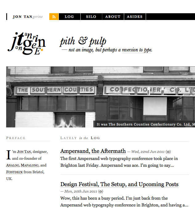
A detail from jontangerine.com (circa 2012). Contemporary typographers draw from a variety of historical theories about and approaches to typography. The playful application of “tangerine” in the upper-left corner is more post-modern than classical.
Classical Pages Aimed for an Even Tone
Text on the classical typographic page was meant to be read in a relaxed, contemplative manner. Thus, there is an even tone on the page: hierarchy is subtle, using changes in size, case, and style (italic) to create emphasis and to chunk text. Capital letters usually have letterspacing added to keep them feeling lighter on the page.
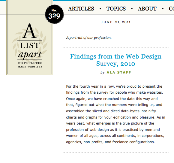
A detail from alistapart.com (circa 2012). A List Apart used to reference classical text using a serif font for their headings, italics for subtle emphasis, and letter-spaced caps (the date, “ALA staff,” the word “list” in their logo). Headings were centered, which is also classical. The use of a sans serif font is a contemporary addition to the classical page.
Classical Pages Convey an Elegant Feeling.
In order to emphasize the frame, text is fully justified and other small amounts of text are often centered. Carefully spaced capital, serif letters feel both formal and delicate. Ornaments are used to add emphasis or help chunk text. The aspiration to keep an even tone on the page leads to seemingly simple and obviously elegant solutions.
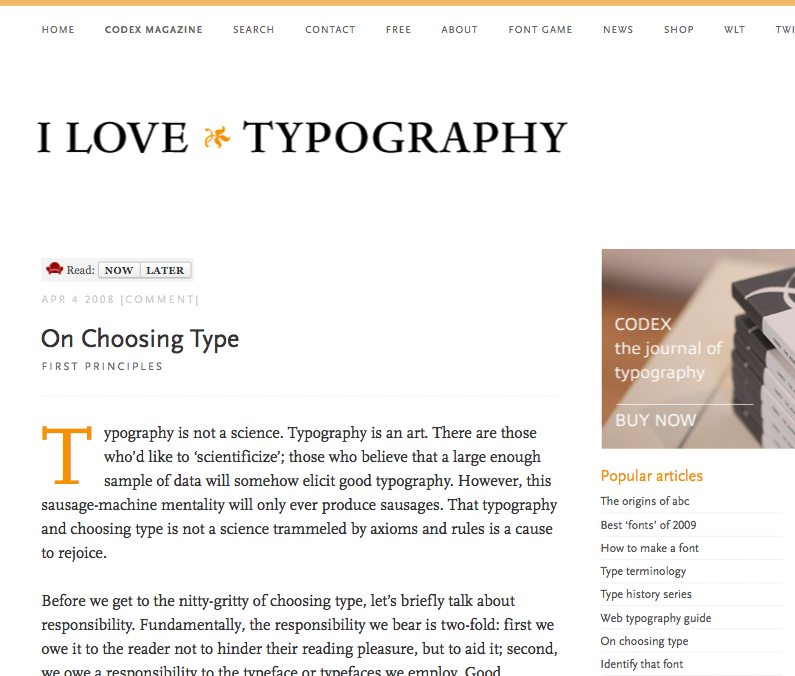
A detail from ilovetypography.com (circa 2012). Some of John Boardley’s pages used to reference the classical page. He used two ornaments on this page: the fleuron in the main heading and the initial cap to start the article. Letter-spaced capital letters (the date, the subheading, the main navigation) feel more formal and delicate.
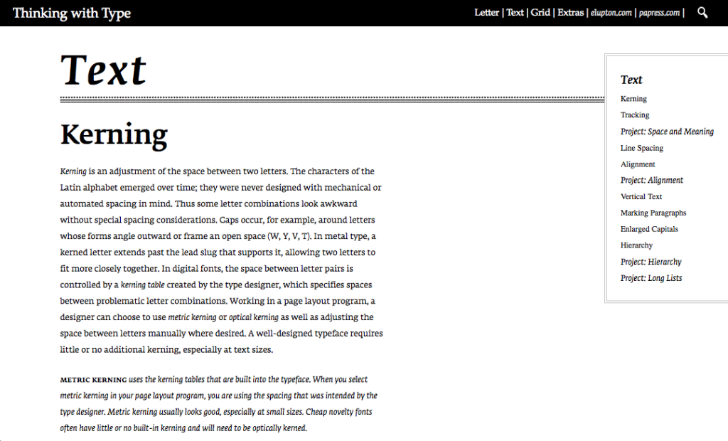
Thinking with Type (one of my favorite type books) references a classic text frame layout, uses serif fonts, italics, letterspaced caps, and ornamentation (rule lines). The result is a contemporary take on the classical page.
The Role of the Typographer
Throughout the centuries, the classical page was seen as an agent to diffuse thought. Unlike posters, broadsides, and bills, books were meant to be contemplated. Books were created to share religious texts, classic literary texts, and scholarly works.
The earliest classical “typographer”—the scribe working in a scriptorium—was considered to be an agent of the divine. The artist-as-creator did not emerge until the Renaissance.
Later classical typographers—printers—reveled in their control of the page. In 1501 Aldus Manutius developed economic “little books of handy size” to share Greco-Latin literature with a larger audience. In the 1750s, John Baskerville developed new inks, paper, and drying techniques to achieve lighter, crisper letterforms.
Regardless of their ability to control the page, classical typographers believed books served the greater good and a common purpose. They believed careful use of type and space helped readers contemplate and comprehend the text.
Quick Tips
When designing the page, you can reference the work of those that came before.
Remember the classical typographic page…
- Tended to use a text frame and serif fonts.
- Has elegance, subtle contrasts, and an overall lightness to the page.
- May have ornaments, borders, and old-style numerals.
- Was designed by typographers who believed books served the greater good and a common purpose. These typographers carefully used type and space to help readers contemplate and comprehend the text.