When choosing a font, ask: does this font convey the right message?
Words have dictionary definitions (denotations) and emotional associations (connotations). Fonts can help communicate both types of meaning.
Fonts are like clothing. We take them in and process their underlying meaning constantly — often not noticing them unless they are either really amazing or really “wrong.” Sometimes the “wrongness” is related to legibility (letters are hard to recognize). Other times it’s related to noticing a font is aesthetically or emotionally mismatched to the meaning of the word or text.
Choosing a Font with Appropriate Associations
The aesthetic and emotional associations readers have with fonts are social constructs. Readers expect wedding invitations to use script fonts, just as they know how to dress for such occasions. On an intuitive level, they also know they shouldn’t see the Declaration of Independence or the U.S. Constitution in Comic Sans (unless it’s a political statement), and they probably won’t ever see the Supreme Court justices wearing vintage Hawaiian shirts on the bench.
The trick is to remember that no font can completely and clearly communicate the emotional associations of a text. No perfect font exists to communicate the complexity of marriage or civil rights, for example, so don’t go looking for a font with hearts or gavels in it. You’ll only undermine the text by drawing readers’ attention to odd elements in the letters. Instead, choose a font that feels like it could work—a font that doesn’t jar readers because it’s inappropriate or unexpected.
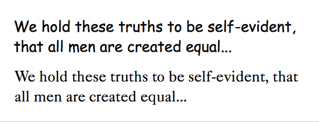
The words themselves communicate the message; the font plays a supportive role. It doesn’t have to (and shouldn’t try to) say, “Look at me! I’m ripe with meaning!” In the example below, Comic Sans looks like what it is: an informal font designed to imitate comic-book lettering. It’s not appropriate for the Declaration of Independence; that would just feel wrong. Caslon 540, on the other hand, is an interpretation of the font (by William Caslon) used to print official copies of the Declaration of Independence on the evening of July 4, 1776. Caslon 540 feels more appropriate, even though most people can’t identify it and don’t know its history. Historic and other literal connections aren’t necessary for readers to form associations between the font and the text.
In the end, Caslon 540 isn’t an appropriate font either, regardless of its historical connection to the text. Legibility aside (smallish x-height, too-small closed counter in e), Caslon 540 isn’t a web-safe font.

Top: Comic Sans is an informal font designed to imitate comic-book lettering. Bottom: Caslon 540 feels more appropriate for the Declaration of Independence.
Choosing Serif Fonts for a Traditional Feeling and Sans Serif Fonts for a Modern Feeling
We’ve built emotional associations with serif and sans serif fonts, influenced by how letters and fonts have been used for hundreds of years.
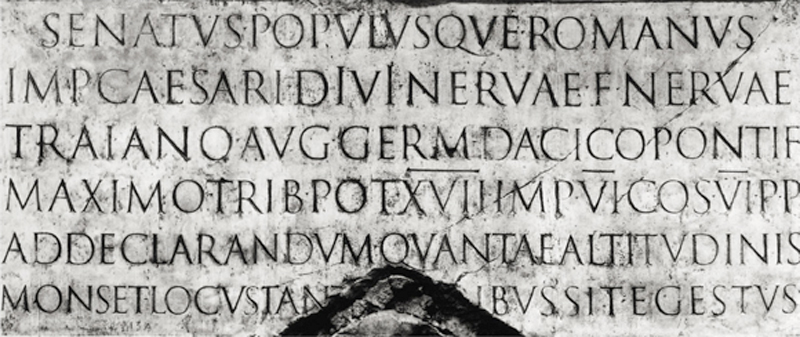
Serif lettering has been part of the cultural landscape since at least the first century CE via inscriptions, handwritten documents, and fonts. The serif letters on Trajan’s Column in Rome were originally brushed onto the stone before being chiseled out and repainted. Informal handwritten documents at the time were done in cursive, but formal documents and manuscripts were written in Latin Book Hand (which was based on the Roman Square Capitals used in inscriptions like Trajan’s Column).
The first successful serif typeface was cut in 1470 by Nicholas Jenson. Thus, for centuries books and printed formal documents were set in serif fonts. Serif letters such as those used for inscriptions, formal documents, and books live in our collective subconscious. We think of them as “old” and “important.”

An inscription on Trajan’s Column, built in 113 BCE. Sans serif lettering was also used in early inscriptions (as early as the fifth century BCE) but didn’t have a presence in handwritten documents.
Experimental sans serif fonts were used in the 1700s, but the first commercial Latin printing type to include lowercase sans serif letters wasn’t in use until 1832. Thus, sans serif letters took a cultural backseat to serif letters until the end of World War I.
In the 1920s, after years of living in a country devastated by war, one group of German designers—the Modernists—wanted to look forward, not backward, to help society move toward a prosperous future. Influenced by industrialization, the Modernists lauded clarity over decoration and function over beauty. They saw decoration as superfluous, including the serifs on letterforms, and accused Traditionalists of living in the past, aping what went before.
For both artistic and economic reasons, Traditionalists and Modernists defended their typographic theories while verbally attacking the other camp. In the end, both groups continued to work in the field. Traditionalism predominated in book design, whereas Modernism predominated in advertising and corporate design. Today, we see Traditionalism and Modernism as peacefully coexisting. We’ve been exposed to both Traditionalist and Modernist typography and have built our own associations with serif and sans serif fonts along party lines.

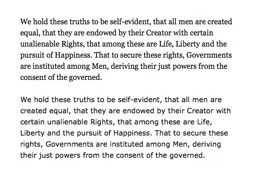
Top: Georgia 15/22 on a 1280×800 MacBook Air screen. Bottom: Verdana 14/22 on a 1280×800 MacBook Air screen. Serif fonts feel “older” and “more important” than sans serif fonts.
Working with Formatting
Connotation isn’t just about fonts. When you’re using small bits of text (a word, a quote, or a heading, for example), it helps to consider how people read meaning into capital and lowercase letters, roman and italic type.
All Caps
Words set in all caps feel important, powerful, reliable, and enduring. The letters are big and demanding. The letters tend to be square, with little variation in shapes and few round (soft) forms. Early Roman and Greek alphabets didn’t have lowercase letters, so inscriptions were done in all caps. Because only the most important words and ideas were worthy of being carved into stone, people began to associate words set in all capital letters with power and importance.
All Lowercase
Words set in all lowercase letters are informal and tend to feel friendly. Variations in form, rounded shapes, and no initial capital letter give lowercase words a common, conversational feeling.

Top: Words set in all caps feel important, powerful, reliable, and demanding. Bottom: Words set in all lowercase letters feel less formal.
Italic
Words set in italic feel humanist because they reference letters written by hand. The letters often have curved endings and thick and thin strokes reminiscent of old pen-and-ink cursive handwriting. Terminals reference where ink may have pooled on the paper. Sans serif italics (often called oblique because they’re slanted rather than italic in form) lack the organic, humanist quality of serif italics.

Italic letters reference letters written by the human hand. Serif italics (left) look more like cursive than sans serif italics (right) do.
Quirky Fonts
Quirky fonts give additional meaning to a word and remind us that we cannot classify type by serif and sans serif alone. Impact, a sans serif font, feels very different from Verdana. Impact’s bold strokes and condensed forms make it feel both powerful and constricting.
Unlike Georgia, Courier (a serif font) does not feel traditional at all. It announces, “Hello. I was written on a typewriter.” The presence of the imaginary typewriter becomes dominant, and the reader wonders whether this is some sort of potboiler justice doled out by Raymond Chandler’s Philip Marlowe.

You cannot classify all serif fonts as traditional and all sans serif fonts as modern. Left: Courier is dominated by the presence of an imaginary typewriter. Right: Impact is powerful and constricting.
Quick Tips
When choosing a font to convey a message, keep in mind…
- Aesthetic and emotional associations are social constructs.
- No font can completely and clearly communicate the emotional associations of a text. Choose a font that seems to work.
- Serif fonts tend to feel traditional; sans serif fonts tend to feel modern.
- Caps are powerful, reliable, and enduring. Lowercase letters are informal and friendly.
- Serif italics feel humanist and more like cursive handwriting than sans serif italics do.
- Fonts play a supporting role to the author’s words. Fonts should never shout “Look at me! I am ripe with meaning!”