If text feels hard to read, people won’t want to read it. One factor that affects readability, and a great place to start, is choosing a legible font.
What Makes a Font Legible?
When we read, we don’t see individual letters; we see (and read) the shapes of the words. These shapes are created primarily by two elements: the strokes of the letters and the spaces in and around the letters. If we lose either of these elements, legibility is compromised.
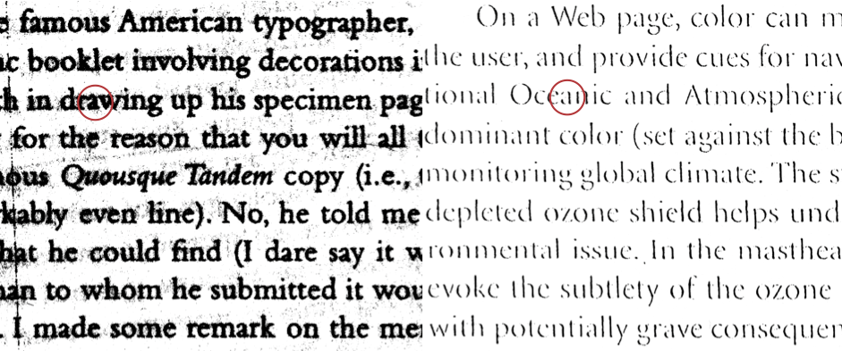
Did you ever try to read a poor photocopy of a photocopy of a photocopy? Experience tells you that type becomes harder to read with each generation of copying.
Why does this happen? Sometimes, the strokes in the text thicker. The spaces in and around the letters start to disappear. At other times, the text gets lighter. Thinner strokes start to disappear, leaving only parts of the letters.
Either way, when strokes or spaces get lost, the legibility of the font changes, and reading becomes more difficult.
Web typographers need to pay particular attention to the strokes and spaces in a font because of screen resolution. Thin strokes and small spaces in letterforms can start to disappear, and as in the photocopy example, the text gets harder to read.
Comparing Georgia and Helvetica
You’ll often hear “simple” fonts are better for the screen because of resolution issues. That’s a good rule of thumb, but it’s not quite enough.
Helvetica is simpler and cleaner than Georgia. But text set in Georgia is a bit easier to read, even though it looks slightly smaller than Helvetica and is a more complex font. Why?
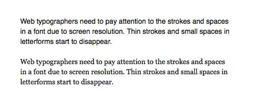
Top: Helvetica 14/20 on a 1280×800 MacBook Air screen. The text is readable, but clunky. Letters feel tight, and the letter e closes up into a circle. Bottom: Georgia 14/20 on a 1280×800 MacBook Air screen is a bit easier to read. Words and letters are more clear, allowing the eye to move quickly along the line of text.
Georgia, by type designer Matthew Carter, was designed for the screen. In typographical terms, it has a healthy x-height without sacrificing the ascenders and descenders. It also has open apertures, discernible terminals, and slightly looser letter spacing than Helvetica. I define all these terms below.
Typographic Terms
Descenders [1] are the strokes of the letters that extend below the baseline.
The baseline [2] is an invisible line that the letters appear to sit on.
Note the descenders in Georgia and Helvetica are almost the same length [3], but Georgia’s serifs give the descenders more presence.
Serifs [4] are little horizontal strokes, usually coming off the top and/or bottom of a stem [5], which is a vertical stroke in a letter.
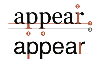
1 descender; 2 baseline; 3 length of descender; 4 serifs; 5 stem. Top: Georgia is a serif font, because it has serifs. Bottom: Helvetica is a sans serif font because it doesn’t have serifs.
Ascenders [6] are the strokes of the letters that extend above the meanline [7] — an invisible line that runs along the top of a lowercase x. The meanline marks the font’s x-height [8], which is the height of the lowercase letters between the baseline and the meanline.
Georgia has higher ascenders than Helvetica [9]. These generous ascenders make Georgia more legible. (Notice that the f and t in Helvetica look very similar.) To compensate for the longer ascenders, Georgia’s x-height is smaller. Unfortunately, this smaller x-height makes the text look smaller (even when it’s set at the same size as Helvetica), but the longer ascenders are worth the sacrifice.

6 ascender; 7 meanline; 8 x-height; 9 height of the ascenders. Left: Georgia has longer ascenders and a smaller x-height, so it tends to look smaller than Helvetica when set in text. Right: Helvetica has a larger x-height, so it looks bigger in text, but the shorter ascenders make it harder to read.
The aperture [10] is the opening in letters such as a and e.
Terminals [11] are the ends of strokes not terminated with a serif.
Georgia’s larger aperture and discernible terminals help with legibility. Helvetica’s e and a look similar. They have a smaller aperture and lack distinctive terminals.
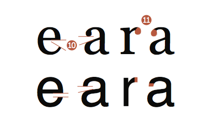
10 aperture; 11 terminal. Top: Georgia’s larger aperture help with legibility. Bottom: Helvetica’s e and a look similar, and the e closes up into a circle at text sizes.
Comparing Web Safe Fonts
Above I compared the web-safe font Georgia with Helvetica, which isn’t web-safe. That might seem odd, but Helvetica is famous for its simplicity and clarity, which makes it the perfect example to show that clean and simple aren’t enough to guarantee legibility onscreen.
Next I’ll compare Georgia to Times New Roman, and Verdana to Arial. All four are web-safe fonts and likely to be on most computers, regardless of platform.
Georgia and Verdana are superior fonts for legibility of text on the web. Designed for the screen, they are easy to read. I use Georgia and Verdana in examples and lessons throughout TWD, but they aren’t the only acceptable fonts.
The number of fonts available to web typographers has exploded. As a web typographer, you should know how to look at and think about the parts of letters so you can identify other legible fonts to use (not just Georgia and Verdana).
Georgia vs. Times New Roman
Georgia is visually larger than Times New Roman. Below I’ve set Georgia a bit smaller (63px) than Times New Roman (68px). The fonts’ x-heights appear equal at these sizes, allowing you to see the differences clearly.
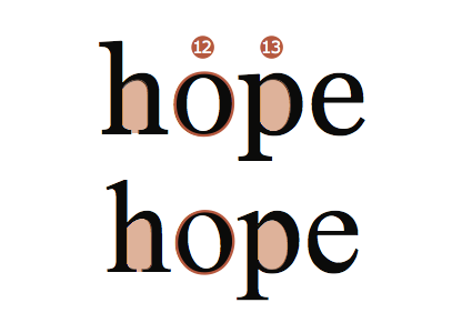
Georgia has rounder, fuller bowls (round shapes in the lowercase letters) [12] than Times New Roman does. A narrower bowl often results in smaller counterforms (spaces within a letterform) [13]. Smaller counterforms in text onscreen can be harder to read.
Georgia’s strokes have less contrast, so thin strokes don’t get lost. Times New Roman has thicker thick strokes and thinner thin strokes. The thin strokes have a tendency to get lost onscreen when the font is used for text. This tendency, combined with the narrower bowl, makes the text look more like a series of vertical strokes. The reader needs to work slightly harder to read the word shapes in Times New Roman.
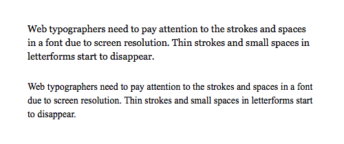
Top: Georgia 14/20 on a 1280×800 MacBook Air screen looks more round and open. This helps readability. Bottom: Times New Roman 14/20 on a 1280×800 MacBook Air screen looks more like a series of vertical strokes and is harder to read.
Verdana vs. Arial
Verdana is a visually larger font than Arial. Below I’ve set Verdana slightly smaller (59px) than Arial (62px). The two fonts’ x-heights appear equal at these sizes, allowing you to see the differences clearly.
Verdana and Arial both have generous bowls — neither is particularly narrow — but Verdana’s bowl has a bit more visual space. Verdana’s shoulder (the part of the bowl that connects to the stem) [14] connects to the stem differently. Notice that the counterforms in Verdana’s h and p have a slight corner, making them more spacious than Arial’s rounded counterforms. Verdana also has more space between letters [15].
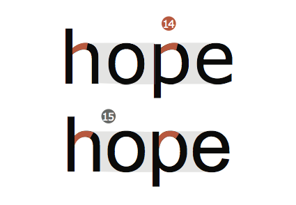
Top: Verdana has more visual space. Bottom: Arial has less visual space. 14 shoulder; 15 letter spacing.
Verdana’s a, c, and e all have a larger aperture, giving the letters even more visual space. All these design decisions keep Verdana more legible at typical text sizes.
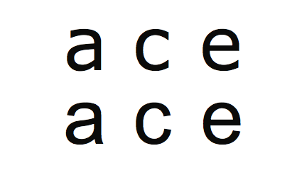
Top: The larger apertures in Verdana create more visual space than those in Arial, thus improving legibility. Bottom: Arial.
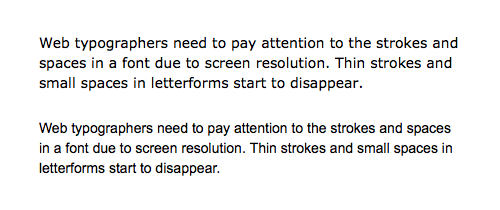
Top: Verdana 14/20 on a 1280×800 MacBook Air screen is very readable. Bottom: Arial 14/20 on a 1280×800 MacBook Air screen. Arial has less visual space than Verdana, both inside and between the letters. Arial feels more cramped, and is harder to read.
Quick Tips
A font for text type (14 to 16px) is easier to read if it has
- A generous x-height
- Open apertures
- Prominent ascenders and descenders
- Slightly loose letter spacing
- Discernible terminals
If you want to learn more about legibility, I recommend
- “It’s About Legibility” by Allan Haley
- “Georgia & Verdana: Typefaces designed for the screen (finally)” by Daniel Will-Harris
- Matthew Carter on wikipedia
If you want to learn more typography terms (anatomy), I recommend
- This illustrated glossary of typographic terms
