A good web typographer can create countless lovely, readable web pages armed with nothing but Verdana and Georgia. But having a variety of web fonts to work with opens up a world of possibilities: new forms and subtle layers of meaning influence how readers experience the text. Thus, you need to carefully build a “library” of fonts: a list of quality fonts you can count on when setting typographic web pages. It helps to know three things when building a font library: classification (based on the history of type), how to identify a good font, and how to access good fonts.
Classification
Typographers classify fonts—grouping them together based on form. It’s like classifying cars: hatchback, sedan, wagon, SUV—classification allows us to create general mental models and helps us talk about fonts. Classification helps us picture what a font might look like—even if we’ve never seen it. It also helps us choose fonts appropriate for the medium (screen) and content.
Many classification systems have been developed over the years. One such system is the Vox-ATypI system (en.widipedia.org/wiki/VOX-ATypI_classification), which makes it possible to classify typefaces into eleven general groups. Robert Bringhurst, author of The Elements of Typographic Style, developed a thirteen-class system aligned with shifts in Western Art history starting with the early Renaissance.
While complex classification systems are great for the true typophile, and allow type designers to discuss subtle differences in serifs, terminals, and stroke weight, they aren’t easy to use. They require expert knowledge of type history, form, and letter-making techniques. For a basic overview of the both the history of type and general shifts in letterforms (the forms of the letters), I recommend a simpler classification system: the five families of type.
Five Families of Type
The five families of type consists of five general categories: Old Style, Transitional, Modern, Slab Serif, and Sans Serif. Usually we add a sixth category when discussing fonts: Display Faces, meant for headlines only (never for text).

Left: Andron, an Old Style web font. Right: Georgia, a Transitional web-safe font. Both are set at 144px.

Left: Serif 72 Beta, a web font with Modern elements. Right: Museo Slab, a Slab Serif web font. Both are set at 144px.

Left: PT Sans, a humanist Sans Serif web font. Right: Museo Sans, a geometric Sans Serif web font. Sans Serif fonts can vary greatly. Both are set at 144px.
The Five Families of Type is a good system to start with for classifying fonts. It does not require an expansive knowledge of type history or the eye to differentiate between a dozen (or more) “classes” of fonts. In addition, the terms are commonly used by other typographers (even if they prefer a different classification system, they’ll know these terms, too).
But there are two problems with this classification system. First, it is too general. For example, Sans Serif typefaces can vary greatly from each other. The term Sans Serif does not help us “picture” a font.
Second, it is based on fonts (typefaces) developed for print. Good web fonts tend to have a different internal structure than typefaces developed for print. Designers who work in both web and print mediums will have to develop different mental models for each term.
Expanding the Five Families Classification System
Because the Five Families of Type classification system is too general, we can use adjectives to help typographers better visualize fonts. Two widely used adjectives are humanist and geometric.
More detailed classification systems use the term humanist for the earliest roman fonts. Humanist/Venetian fonts are older than Old Style fonts. Humanist is also used with Sans Serif fonts to describe letters that reference the human hand.

Left: Calluna has some humanist elements, such as the rising crossbar on the e and the pen-formed terminal on the a. Calluna, by Jos Buivenga, is a web font and holds up well on the screen. Right: Centaur, a humanist-inspired font for print. Both are set at 144px.
Old Style
Old Style fonts feel more traditional or “old.” They are based on forms created by writing letters with pen and ink, but are not calligraphic or script fonts. Adobe Garamond (print) and Andron (print and web) are examples of Old Style fonts.

Left: Andron, an Old Style web font by Andreas Stötzner. Unfortunately, it lacks legibility at small text sizes on the web, due to its small x-height and small closed counters in the a and e. Right: Adobe Garamond, a digital version of an Old Style font (originally attributed to Claude Garamond) for print. Both are set at 72px.
Old Style fonts have pen-formed terminals, wedge-shaped serifs (also called “adnate” serifs) that flow into the stems of the letters, and less contrast between thick and thin strokes. They also have a diagonal stress. The “stress” is the imaginary line drawn between the thinnest parts of the bowl. All of these structural elements mimic letters formed by pen and ink.
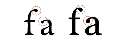
Left: Andron. Old Style fonts mimic pen-formed letters. They have pen-formed terminals and a smaller x-height. Right: Compare to Georgia, a Transitional font. Both are set at 180px.
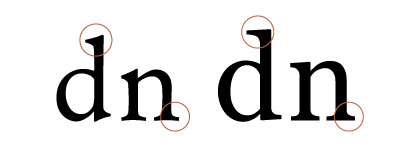
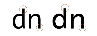
Left: Andron. Old Style fonts have adnate serifs—they flow into the stem. Head serifs are wedge-shaped. Foot serifs have curved bottoms. Right: Compare to Georgia, a Transitional font. Both are set at 180px.
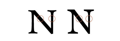
Left: Andron. Old Style fonts have less contrast between the thick and thin strokes in letters. Right: Compare to Georgia, a Transitional font. Both are set at 180px.
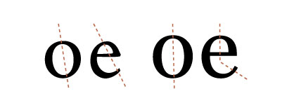
Left: Andron. Old Style fonts have a slanted stress (the invisible line between the thinnest parts of the bowl). Right: Compare to Georgia, a Transitional font. Both are set at 180px.
Old Style fonts designed for print have smaller x-heights and small closed counters on the lowercase a and e. Good web fonts deviate from this structure in order to retain legibility.
Old Style fonts can be used for text or headlines, and give a traditional or “old” feeling to the text, partially because they are reminiscent of the mid-fifteenth to mid-eighteenth centuries. They need to be set larger because of their small x-height.
Beware of fonts that have overly emphasized pen-formed terminals and serifs—they can draw attention to themselves and undermine the flow of words.
Transitional
Transitional fonts feel traditional, but are “crisper” than Old Style fonts. More concerned with ideal letters than pen-formed letters, Transitional fonts have teardrop-shaped terminals, more contrast between thick and thin strokes, and generally horizontal serifs that flow into the stems of the letters. Stress tends to be more vertical, and changes as needed throughout the font .
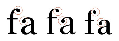
Left: Georgia. Transitional fonts have teardrop-shaped terminals. Middle: Although Serif 72 Beta still has teardrop-shaped terminals, they are crisper, which makes the font feel Modern on screen. Right: Bodoni BE. Modern fonts have ball-shaped terminals. All are set at 180px.
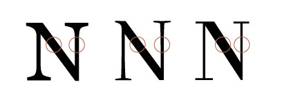
Left: Georgia. Transitional fonts have contrast between thick and thin strokes. Middle: Serif 72 Beta’s high contrast between thick and thin strokes makes the font feel Modern on the screen. Right: Bodoni BE. Modern fonts have extreme contrast between thick and thin strokes. All are set at 180px
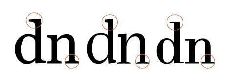
Left: Georgia. Transitional fonts have crisp adnate (flowing into the stem) serifs. Middle: Although Serif 72 Beta’s serifs aren’t Modern, the thin foot serifs make the font feel Modern on screen. Right: Bodoni BE. Modern fonts have very fine serifs that meet the stem at a right angle. All are set at 180px.

Left: Georgia. Transitional fonts have a slight, non-uniform stress. Middle: Serif 72 Beta. Serif 72 clearly has a Transitional stress. Right: Bodoni BE. Modern fonts have a vertical stress. All are set at 180px.
Transitional fonts were originally designed in the mid-eighteenth century with control (of form, of the printing process) in mind. A well-known Transitional font for print is Baskerville, designed by John Baskerville, who dedicated most of his career to controlling the printing process. He created new techniques for making and drying paper and ink. His contemporaries accused him of trying to blind his readers with his higher-contrast typefaces.
A well-known Transitional web font is Georgia. Transitional web fonts continue to have teardrop-shaped terminals and crisp, adnate serifs, but lose the delicate beauty associated with Transitional print fonts.

Left: Georgia, a Transitional web-safe font designed by Matthew Carter. Designed for the screen, it has more substantial strokes, larger closed counterforms in the a and e, a larger x-height, and more defined terminals than you’d usually see in a traditional Transitional font. Right: A contemporary version of Baskerville (Monotype), a Transitional font originally designed for print by John Baskerville. Both are set at 144px.
Transitional fonts can be used for text or headlines, and give a traditional feeling to the text without feeling quite so “old.”
Modern/Didone
Modern fonts feel very crisp and elegant. They are based on drawn letterforms with extreme contrast of thicks and thins, ball-shaped termnals, and thin, delicate serifs that create a crisp corner with the stem. They also have a vertical stress.
Modern fonts are not contemporary; they were modern in the late eighteenth century. Continued advancements in printing technology and paper allowed for such crisp, elegant letterforms to be printed cleanly. This classification is sometimes called Didone after the first Modern font. Another well-known Modern font for print is Bodoni. Serif 72 Beta is a web font with both Transitional and Modern characteristics. It’s gorgeous at large sizes, but difficult to read as text.

Left: Serif 72 Beta, a web font with both Transitional and Modern characteristics designed by Christian Robertson (Betatype). Right: A contemporary version of Bodoni (BE), a Modern font originally designed for print by Giambattista Bodoni. Both are set at 144px.
Modern fonts should never be used for text, as their thin strokes get lost on the screen. They are great for headlines, and add elegance to a typographic layout.
Slab Serif
Slab Serif fonts were originally designed to say, “Look at me!” Characterized by uniform strokes and heavy serifs equal to the strokes, Slab Serif fonts came of age during the Industrial Revolution in the early nineteenth century.
Changes in printing and paper-making technology allowed for increased (quick, inexpensive) advertising. Fonts shifted use from subtle text in books to loud words on broadsides (posters).
Traditionally, Slab Serif serifs are unbracketed—they are not adnate. They do not flow into the stem. Slab Serifs are the same thickness as the other horizontal strokes in letters, and can be blunt and square or rounded.
As with every class in this system, there are a variety of Slab Serif fonts. Some contemporary Slab Serif fonts have contrast between thick and thin strokes. Serifs end up thinner than traditional Slab Serif serifs. Geometric Slab Serif fonts have a mathematical consistency to them. Museo Slab is a Slab Serif font with geometric characteristics, while DejaVu Serif is not geometric. Both are available for font-linking.
Traditional Slab Serifs should be used with care in text. Thick strokes and serifs can result in smaller counterforms, and reduced space hinders legibility. Look for a Slab Serif with open counterforms, a generous amount of space between letters, and more delicate strokes, like Museo Slab and DejaVu Serif.
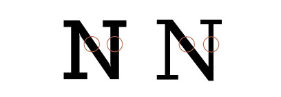
Left: Museo Slab. Traditionally monoline, Slab Serif fonts do not have an appreciable contrast between thick and thin strokes. Right: DejaVu Serif is a contemporary Slab Serif font, and has contrast between thick and thin strokes. Both are set at 180px.

Left: Museo Slab. Slab Serif serifs are unbracketed, or not adnate; they meet the stem at a right angle. Traditionally, slab serifs are the same weight as the other horizontal strokes in the letters. Right: DejaVu Serif. Both are set at 180px.

Left: A contemporary version of Rockwell, from the Monotype library. Serifs are square. Right: A contemporary version of Courier, originally designed by Howard “Bud” Kettler for IBM. Serifs are rounded. Both are set at 132px.
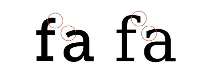
Left: Museo Slab. Traditionally, Slab Serif fonts are monoline. Strokes end abruptly and do not create a terminal shape. Right: DejaVu Serif is a contemporary Slab Serif font. Both are set at 180px.
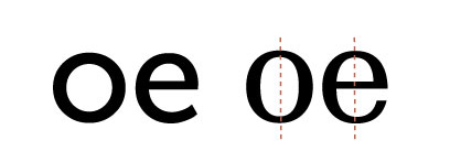
Left: Museo Slab. Traditional, monoline, Slab Serif fonts do not have a stress; bowls are usually circular. Right: DejaVu Serif is a contemporary Slab Serif font. Both are set at 180px.

Left: Museo Slab is a Slab Serif font by Jos Buivenga. Designed for print, it has consistent strokes, round bowls, and a mathematical consistency to the letters. Due to open counterforms and generous letterspacing, the font remains legible on screen. Right: DejaVu Serif is a Slab Serif font with a narrower bowl, chiseled terminals, and contrast between thick and thin strokes. Both are available for font-linking. Both are set at 132px.
Sans Serif
Sans Serif fonts feel more contemporary than serif fonts, even though sans serif letters have been around since the fifth century BCE.
Characterized by uniform strokes and no serifs, Sans Serif fonts are often associated with the twentieth century because they gained popularity after World War I. Helvetica is probably the most well-known Sans Serif. Arial was one of the original Sans Serif fonts created for (as opposed to designed for) the screen.
Like every class in the system, there are a variety of Sans Serif fonts. Sans Serif fonts can be used for either text or headlines.
Geometric Sans Serif fonts have a mathematical consistency to them; their bowls tend to be perfect circles. Museo (available for font-linking) and Futura (print) are geometric Sans Serif fonts.
Humanist Sans Serif fonts reference the human hand. Gill Sans (print) and Verdana (web) are humanist Sans Serif fonts. With modulating strokes, they feel less mechanical than other Sans Serif fonts.
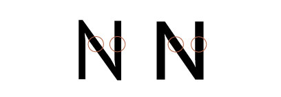
Left: PT Sans. Sans Serif fonts do not have an appreciable contrast between thick and thin strokes. Right: Museo Sans. Both are set at 180px.
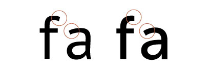
Left: PT Sans. Humanist Sans Serif fonts tend to have a modulated stroke; terminals do not have an extra shape. Right: Museo Sans, a geometric Sans Serif, has more monoline strokes. Both are set at 180px.
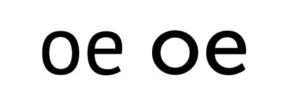
Left: PT Sans. Sans Serif fonts do not usually have a true stress, because strokes are usually monoline. Right: Museo Sans. Both are set at 180px.

Left: Arial. Created but not designed for the screen by Monotype, Arial lacks generosity of x-height, counterforms, and letterspacing, all of which promote legibility on screen. Right: A contemporary version of Helvetica, designed by Max Miedinger, a Sans Serif font design for print. Both are Neo-Grotesque Sans Serif (also called Anonymous Sans Serif due to their plain appearance). Both are set at 144px.

Left: Museo Sans, designed by Jos Buivenga, has a “double-decker” a. Right: A contemporary version of Futura, designed by Paul Renner for print. Most geometric Sans Serif fonts have a “single-decker” a (the a is a circle with a line on one side), making them feel even more geometric. Both are set at 144px.

Left: Verdana, designed by Matthew Carter, is a humanist Sans Serif font designed for the web. Referencing the hand, humanist Sans Serif fonts usually have modulated strokes, narrower bowls, and open apertures. Right: A contemporary version of Gill Sans designed by Eric Gill for print. Both are set at 144px.
Display Fonts
Display fonts are used for large type (headings, pull quotes) only. They are not appropriate for text. Classification of display fonts is less consistent than text fonts. They are often grouped according to a single characteristic—distressed/grunge, retro, script, art deco, and so on. But display fonts are so varied, they are difficult to describe using a single term. For instance, some of my favorite display fonts are Selfish (a distressed, elegant script), BlackJack (a script with some lovely thicks and thins), and EastMarket (a retro font with soft corners, substantial thick strokes, and a funky lowercase s).
Identifying Good Web Fonts
A good web font makes no excuses. It never says, “If only you could see me in print.” For example, an exquisitely designed font with extremely thin strokes and delicate serifs might be beautiful printed on high quality paper, but if strokes and serifs get lost on the screen, it’s not a good web font. Always evaluate web fonts based on how they perform on screen, not in print.
Good Text Fonts for the Web
What qualities should you look for when choosing text fonts for the web? A good web text font usually has a generous x-height, open counterforms, and a generous aperture. It has generous (but not too generous) letterspacing.
It does not have thin strokes or delicate serifs, which can get lost on the screen. Nor does it have strident serifs or terminals (which draw attention to themselves and undermine the flow of words).
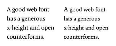
Left: Calluna is more legible because it has a generous x-height and open apertures (though the font is not as smooth on Windows). Right: Andron is slightly less legible at text sizes due to a smaller x-height and smaller closed counterforms in the a and e.
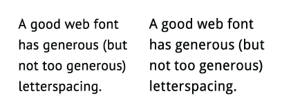
Left: PT Sans has generous letterspacing, which helps with readability on screen. Right: Droid Sans’ letterspacing is a little too loose, which can undermine readability.
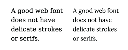
Left: DejaVu Serif has a contrast between thick and thin lines, but remains legible on screen at text sizes. Right: Serif 72 Beta’s thin strokes and serifs are too delicate. The font is hard to read at text sizes on screen.
A great web text font has all of the characteristics already mentioned, plus multiple styles (roman, italic, bold) to meet your needs (even a simple bibliography needs a good italic). A great web text font works well as text but also looks great big (for headings).
Some delightful and well-designed web fonts available for font-linking don’t have multiple styles. You can use size, case, and color to meet your needs. But a great web text font has the styles and weights you need.
Good Display Fonts for the Web
A good display font has consistent letterspacing. Script fonts especially need excellent kerning (spacing between pairs of letters); otherwise, letters will overlap or have big gaps between them. If you want a script that connects, connections should be as clean as possible.
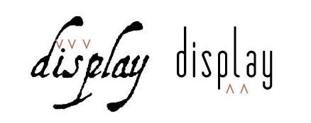
Demand consistent and healthy kerning. Left: A script font with inconsistent spacing. Right: A Sans Serif font with inconsistent spacing.
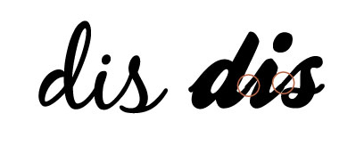
Avoid using a script font with bumpy connections. Left: BlackJack’s connections are well integrated into the font. Right: This font’s connections are not very good, making the stroke of the script look odd in places.
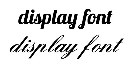
Do you want a script with connections? Left: Lobster doesn’t connect every letter, but the breaks are integrated into the design. Right: This font looks broken. The forms of the letters make us expect them to connect, and they don’t. It’s disconcerting.
A display font should look good at the size you need it, have all the characters you need, and maintain legibility. It should be well proportioned: the parts of the letters should work together in harmony; no element demanding our attention. Letters should complement each other: the curves should feel like they belong to the same pattern; the black and white shapes in the letters should be balanced.
Finally, a display font should work with the word or words you need to set. Some display fonts look great until you use them with your text—and realize one or more letters don’t work with the overall design of your page.

Do details hold up at the intended size? Even with good, fun fonts, if you use them too small, you’ll lose the details that make them unique. Left: GrutchShaded. Right: Astonished.

Choose a well-proportioned font. Left: Calluna is well proportioned. The parts of the letters work together in harmony Right: This font is not well-proportioned. The thick angled serifs on the u demand more attention than they should. The crossbar on the e feels too thin compared to the bowl of the letter. The s looks slightly small between the u and the e.

Choose a well-designed font. Left: Museo 700 is a well-designed font. The curves relate to each other, the black and white shapes are balanced. Right: This font is not well designed. The serifs are overpowering, the white space in the u is awkward, and the white spaces in the s are way too small. The top and bottom of the e look like they belong to two different letters!

Choose a font that looks right with your word or words. Even beautiful, well-designed fonts you love can have a letter that feels odd in the context of your page design. Left: EastMarket. I love this font, but the s is not appropriate for every design. Right: HamburgerHeaven is another favorite, but the e is unique, and is not right for every design.
Building Your Font Library
A good typographer can work with the same font over and over, making it sing every time. Building a font library is not about collecting fonts just to have them (although we all do it). It’s a matter of…
Look for what you’re missing that your content needs. Introduce a font to your palette because you’re working with content that needs it.
Build your library slowly and surely. Work extensively with each font until you know it intimately. To start, choose a couple of serif fonts and a couple of sans serif fonts. Figure out everything you can do with them. This will help you identify what you need in a new font.
Look at what others are doing. Find people who strive for quality typography and learn from them. When you see a website with type you like, use a tool like whatfont, to see what font (at what size and color!) is being used. It’s okay to disagree with or modify what others do as well. Test your own ideas.
Be willing to pay for a font. You’ll have more options and get better quality—more styles and weights, better spacing, and fonts that work both large and small.
Free or Open-License Fonts
Using free or openly-licensed fonts is a great place to start your library—especially if you are a student, or just starting to look for web fonts to use. There are a handful of free fonts (Museo, PT Sans, Droid Serif, Merriweather are four that come to mind) that you can use to set beautiful pages of web typography for many years.
I love free web fonts. FontSquirrel and Google Fonts are great places to start when learning web typography—especially if you are a student. But if you want more variety of well-designed font families (complete with a variety of weights and styles), you need to be willing to pay.
And, unfortunately, most free fonts are not great text fonts. They lack legibility and beauty. I keep a resource (Good Web Fonts) of lively, subtle, perfectly legible fonts for the web. I test dozens of fonts for every one web font I recommend.
With a handful (or two) of good free web fonts, your choices are still limited. Many free fonts only include roman (and if you are lucky, italic and bold). If you want to use the whole font family—if you want light and heavy weights—you usually need to pay for it.
Plan to expand your font library beyond what you can use for free. Luckily, between Verdana, Georgia, and a handful of quality free fonts, you can take your time figuring out what you need.
Purchasing Web Licenses
A few foundries (fontspring.com, typotheque.com, fontshop.com) sell web licensing for fonts. As a consumer, you can purchase a print license, a web license, or a combined license.
Upon purchase, you own a license to use the font. There is no yearly fee. Purchasing a web license expands your library legally, honestly, and with professionally designed font families. When you purchase a web font, you install the font on your own server and use the @font-face syntax to use the fonts on your web pages.
Many of these fonts were originally designed for print, so consider them carefully before purchasing a license. Also be aware that, while many licenses include unlimited website use and unlimited page views, this is not true for all licenses. Double-check the number of permitted websites and page views before purchase.
Subscription-Based Services
Subscription-based services keep the fonts on their servers. Designers use a bit of code in their HTML to access the fonts. The fonts are more secure, so type designers are more comfortable allowing fonts to be used for font-linking.
Typekit (typekit.com) offers a variety of reasonable packages. A portfolio package, allowing you to use an unlimited number of their fonts on an unlimited number of websites (not just your own, but your clients’ sites, too) is $49.99 per year. Some of the fonts offered are also available as free fonts, but you’ll get more with a subscription (more styles and weights—and less syntax to manage). Their text font offering has improved substantially over the past year. Paying for a yearly package is great for building a foundation of web fonts, which you can supplement as needed with web licenses you purchase or subscribe to elsewhere.
Fontdeck (fontdeck.com) offers a variety of high-quality fonts at reasonable subscription rates. You pay only for the fonts you use, and you pay per website, per year. Be aware, you’ll need to subscribe to each style in a font you want to use. One great thing about Fontdeck is that they allow you to test-drive all of their fonts for free. Fontdeck has retired.
When choosing a subscription-based service, examine the following characteristics:
- Ease of use (can you get the fonts working, on your own, immediately?)
- Quality of fonts provided (don’t be swayed by the number of fonts they offer—how many will you actually use? How many are print fonts that don’t hold up well on screen?)
- Cost (access to better fonts with more styles is worth more money, but read the fine print—know how many websites, page views, and styles you get for the price).
Buyer Beware
Beware of popular fonts designed for print that are licensed for the web. They may not hold up on screen.
Don’t buy a font unless you know it will work the way you need it to. If you’ve tested fonts with a resource like FontSquirrel or Google Fonts, you’ve probably experienced a common problem: thinking a font looked great until you used it with your text. If possible, test new fonts at text size, not display size, before purchase.
Try to see the font in action. Does the foundry provide a list of websites using the font? If not, can you find any on your own? Does the foundry provide examples of the font in use—in HTML, not pretty illustrations of the font at display sizes? Good foundries and subscription-based services provide a gallery of websites, like Typekit’s, where you can visit the actual sites and see fonts in use.
Finally, shop around. There are various ways to build your font library. Use the method that works best for you.
Quick Tips
When building a font library for the web, remember…
- Typographers classify fonts—grouping them together based on form.
- Having a classification system helps us picture what a font looks like based on its classification: Old Style, Transitional, Modern, Slab Serif, and Sans Serif.
- A good text font usually has a generous x-height, open counterforms, a generous aperture, and generous spacing between letters.
- A good text font usually does not have thin strokes or delicate serifs, strident serifs or terminals.
- You can build your library slowly, over time. Get to know the fonts you have. Choose new fonts based on what the content needs that your current fonts can’t provide.
- Most free fonts are not appropriate for text. Those that are often have limited styles. So be willing to pay for fonts.
