Deciding whether the font can do the job starts with reading the text. Is the text complex? Does it have multiple sections and subsections in need of headings and subheadings? Does the author want to emphasize certain ideas? Do you need or want to italicize titles, quotes, or other items? Are there any repeating words or phrases (e.g., the name of a product or company)?
If you answer “yes” to any of these questions, you need to choose a font that can do the job. You need a font family that works for repetitive words and phrases and has all the styles and weights you need. A font family is made up of all the styles in the font. Most families include regular, bold, italic, and bold italic. More complex families include more styles and weights.

Two font families. Left Georgia. Right Verdana. Most basic font families include regular, bold, italic, and bold italic.
What Should I Look for in a Bold Style?
Contrast
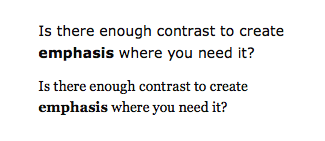
Is there enough difference between the bold and regular styles to create visual contrast? Will bold words catch the reader’s eye as he scans the text? Will bold words create emphasis without overwhelming the regular text or screaming at the reader?

Top Sans serif fonts tend to have visually heavier bolds than serif fonts, with greater contrast between bold and regular. Bottom Serif fonts traditionally have less contrast between bold and regular.
Not every bold is alike. Sans serif fonts tend to have visually heavier bolds. Why? Sans serif fonts tend to be monoline (all the strokes have similar thickness). When a bold version is designed, every stroke gets significantly thicker, resulting in a visually heavier bold than one designed for a serif font.
A visually heavier bold could be exactly what you’re looking for if words or ideas must really jump out at the reader. On the other hand, your text may call for a more subtle contrast.
Legibility
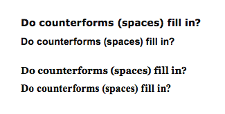
Sometimes, the strokes in bold styles get so thick that the counterforms get lost. This situation can happen if a font was designed for print (the designer didn’t build in enough counterspace) or a font family wasn’t designed as a system (the designer paid more attention to the regular weight, simply thickening strokes when a bold style was needed).

Top to bottom: Verdana Bold, Arial Bold, Georgia Bold, and Times New Roman Bold. Choose a bold style with open counterforms. If spaces in and around the letters are too small, the text is harder to read on screen.
What Should I Look for in an Italic Style?
Shapes of letters
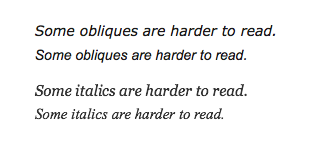
Not all “italic” styles are italic. Some are oblique (slanted). True serif italic letters feel like handwriting; they have curved endings, and thick and thin strokes. Sans serif italics feel like regular letters that have been slanted.

Not all italic styles are really italic. Most sans serif italics are oblique. Notice the different forms of the i and f in the serif italic and the sans serif oblique.
Legibility
Sometimes italics lose legibility. The spaces inside and around the letters can get smaller as the letters get narrower. Oblique letters become more illegible as the forms of the letters are squished over on an angle.

Top to bottom: Compare Verdana Italic, Arial Italic, Georgia Italic, and Times New Roman Italic. Choose an italic (oblique) style with open counterforms. If spaces in and around the letters are too small (as in Arial Italic and Times New Roman Italic), text is harder to read.
Contrast
The contrast between regular and italic text is subtle. Italic is often used for titles and quotes that are meant to be read as part of the overall text, rather than for catching a reader’s eye as he scans.
What Else Should I Consider in a Font?
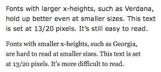
Legibility at small sizes
Sometimes, text includes captions, footnotes, or other elements that you want to deemphasize. Choose a font that continues to be legible even at small sizes.
Capital Letters
If the text includes a lot of capital letters, or if you want to use all caps for a heading, consider what the capital letters in the font look like. Are the forms pleasing and easy to read, or do they take up too much space?
Numbers
There are two kinds of numbers: lining and old-style. Lining figures are based on the proportions of capital letters. Old-style figures (also called text figures or non-lining figures) have ascenders and descenders. They blend into text better than lining figures do because they resemble lowercase letters.

Lining figures blend in with capital letters, whereas old-style figures blend in with lowercase text.
Poet Robert Bringhurst wrote in The Elements of Typographic Style, “[Old style figures] are basic parts of typographic speech, and they are a sign that dollars are not really twice as important as ideas, and numbers are not afraid to consort on an equal footing with words.”
Width of the Font
Fonts take up different amounts of horizontal space. They have narrower or wider bowls, and more or less space around the letterforms. A narrower font will fit comfortably in a narrow column, whereas a wider font tends to need a wider column.
What If I Can’t Get Everything I Want from a Font?
You have many things to consider when choosing a font: bold, italic, caps, numbers, font width, legibility at small sizes, and so on. What if you can’t get everything you want?
The truth is, you probably won’t. As a typographer, you need to balance everything the text needs with everything you want and decide what characteristics are most important.
Quick Tips
When deciding whether a font can do the job…
- Look for repeating words and phrases in the text (e.g., the name of your product or blog). Make sure those words and phrases look good in any font you’re considering.
- Look for a bold that provides enough contrast but is still legible.
- Look for an italic that has the shapes/quality you want and retains legibility.
- See whether the font remains legible at small sizes.
- Look at the capital letters. Ask yourself whether they’re pleasing and easy to read or too big.
- Look at the numbers. Ask yourself whether they blend in with the text or are lining figures and look more like caps.
- Look at the width of the font. The wider the font is, the longer the line length (column width) will be.

