A common misconception is that text should be set in a serif font and headlines should be set in a sans serif font. This isn’t always necessary. You didn’t need two fonts (one serif, one sans serif) to make the bibliography work in the preceding HTML/CSS lesson. When you use size, case, and style wisely, you can create elegant, well-organized solutions for almost any project with only one font.
At times, though, you need (or want) to use two fonts. In this chapter, I show you how to choose two fonts to work together.
Display Type: Using a Second Font
Display type (18px or bigger, usually used for headings and pull quotes) is a common way to add a second font.
Identify What You Need
The first step in choosing a second font for display type is to ask yourself why you want to use one. If your only reason is to create contrast, I recommend you reconsider. You can create contrast with a single font by using size, color, case, weight, and placement.
A second font adds more than just contrast; it also adds a voice to the text. A second font communicates an aesthetic or emotion that the original font doesn’t.
To pick the style of second font you need, answer a couple of questions:
- What extra layer of meaning (connotation) do you want to communicate?
- What do you need the second typeface to do for you?
After you answer these questions, you’re ready to look for a display typeface to go with your text face.
Consider Concord and Contrast
When two fonts are used together, they need to have the right balance of concord and contrast. Too much similarity or contrast between the fonts creates discord.
If two fonts are too similar, they’re like two shades of a color that don’t quite match, but feel like they should. If two fonts have nothing in common, they feel like they don’t belong together.
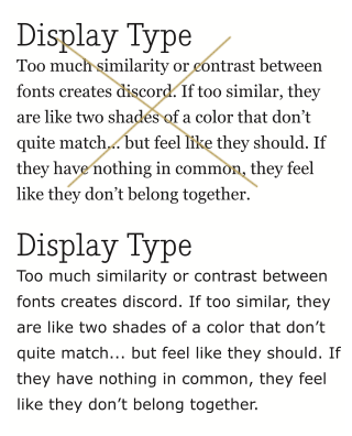
Top: Nadia Serif (in the heading) combined with Georgia. The fonts are too similar to work well together. There’s not enough contrast. Bottom: Nadia Serif with Verdana is a better match. The fonts contrast in strokes and serifs but have similar letter structures and x-heights.
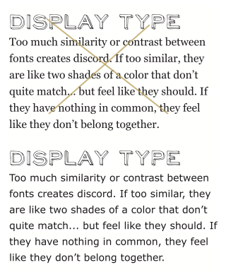
Top: NeoRetroDraw combined with Georgia. The fonts are too different to work together. NeoRetroDraw is hand-drawn, sans serif, all caps, geometric. Georgia is none of these things. Bottom: NeoRetroDraw with Verdana is a better match if the typographer is looking for a hand-drawn second font; both fonts are sans serif.
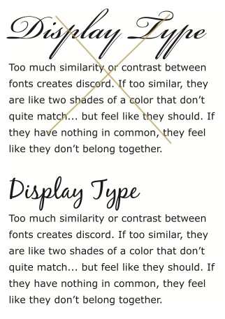
Top: Beautiful ES combined with Verdana. The fonts are too different to work together. In addition to the contrast between script and roman forms, Beautiful ES has thick and thin strokes that are usually associated with more traditional fonts. Verdana’s strokes are more uniform, so the font feels less traditional. Bottom: BlackJack with Verdana is a better match if the typographer is looking for a script second font. BlackJack has less contrast between thick and thin, less slant, and a less traditional feel than Beautiful ES.
A good rule of thumb for choosing a second font is “Don’t settle.” If a display font doesn’t match the mood of the text or work with the text type, keep looking. Always be willing to go back and develop new solutions rather than settle for a font that’s not right.
If you can’t find the right display font, then don’t use one! In the last exercise, you achieved concordance by using the same font throughout. You created contrast with size, weight, or case.
When working with two fonts, you need to consider their structures (x-height, bowl shape), strokes (monoline, thicks/thins), styles (script, retro, distressed, hand-drawn), and serifs. If too many characteristics are the same, the fonts are probably too similar. If too many characteristics are different, there’s probably too much contrast.
Text Type: Using a Second Font
Text type (14–16px, usually used for text) is another way to bring in a second font. It’s becoming more common to use a second font for text on the web as more legible, well-designed, legal web fonts become available.
Identify What You Need from a Second Text Font
The first step in choosing a second font for text is asking yourself why you want to use one. If your only reason is to add flavor because Georgia and Verdana are so ubiquitous, I recommend you reconsider. Ubiquitous type is like ubiquitous air.
Choosing to add a second font to add flavor is like spraying air freshener because you want to draw attention to the smell of a room. Sometimes, you want people to notice what a room smells like (especially if you’re a fantastic cook), but usually not. Smell can be intrusive, distracting people from the intended experience. Trying to read information and ideas through a typeface with flavor is like trying to enjoy a movie when the guy behind you is wearing too much cologne.
To pick the second font you need, ask yourself a couple of questions:
- How will the second typeface help you respect, clarify, and share the information and ideas in the text?
- What do you need the second typeface to do for you?
Consider Balance and Continuity
Concord and contrast are even more important when you’re choosing a second text type font. Display type is intended to stand out; it’s meant to be read separately from the text. Text type, however, is usually meant to be read as a continuous unit.
A second font brings another voice to the text. It can emphasize or deemphasize; it can provide the voice of reason or create a dreamlike state. It shouldn’t make readers stop in their tracks (unless, of course, the writer intended to have that effect). As with display type, two text-type fonts shouldn’t be too similar. One of the fonts will look like a mistake or have too much contrast.
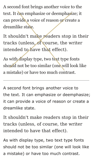
Top: DejaVu Serif combined with Georgia. The fonts are too similar to work well together. Bottom: DejaVu Serif combined with Verdana is a better match. The fonts contrast in strokes and serifs but have similar letter structures.
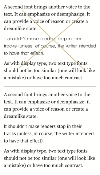
Top: Walkway Bold combined with Georgia. The fonts are too different to work together. In addition to the contrast between serif and sans serif, Walkway Bold has geometric forms (the bowl is a perfect circle) and a thinner stroke. Even the bold version feels light compared with Georgia. Bottom: PT Sans with Georgia is a better match. The fonts contrast in serifs, but their bowl shapes are less extreme in contrast, and their stroke weights complement one another.
When mixing text fonts, try to find two fonts with similar structures. Avoid significant variance in bowls (narrow/circular/wide), extensions of ascenders and descenders (long/short), x-heights (generous/small), and apertures (open/closed). If one of the fonts feels larger or smaller than the other, balance the fonts optically rather than mathematically.

Balance fonts optically. Size fonts so that their x-heights match. Unfortunately, this guideline isn’t always achievable in web typography, because you can’t work in increments smaller than one pixel. But get as close as you can. Verdana 72px (left) needs to be reduced to 64px (center) to match Georgia 72px (right).
About the Fonts Used in This Chapter
The seven new fonts used in this chapter are legal to use with @font-face, and are available free from fontsquirrel.com.
Quick Tips
When choosing a second display font…
- Identify what you expect the font to communicate.
- Balance concord and contrast (not too similar; not too different).
- Consider structures (x-heights, bowl shapes), strokes (monoline, thicks/thins), styles (script, retro, distressed, hand-drawn), and serifs.
- Avoid settling for a font that doesn’t work.
When choosing a second font for text…
- Identify how a second font will help respect, clarify, and share the information and ideas in the text.
- Create continuity by balancing concord and contrast.
- Avoid significant variances in bowls, extensions of ascenders and descenders, x-heights, and apertures.
- Balance fonts optically rather than mathematically.