One way to learn about the structure of a font is to slow down and pay attention to the details. In this first exercise, you’ll do this by tracing letters from fonts.
In Anatomy & Legibility, I talked about Times New Roman, Georgia, Arial, and Verdana. All four are web safe fonts.
Web Safe Fonts
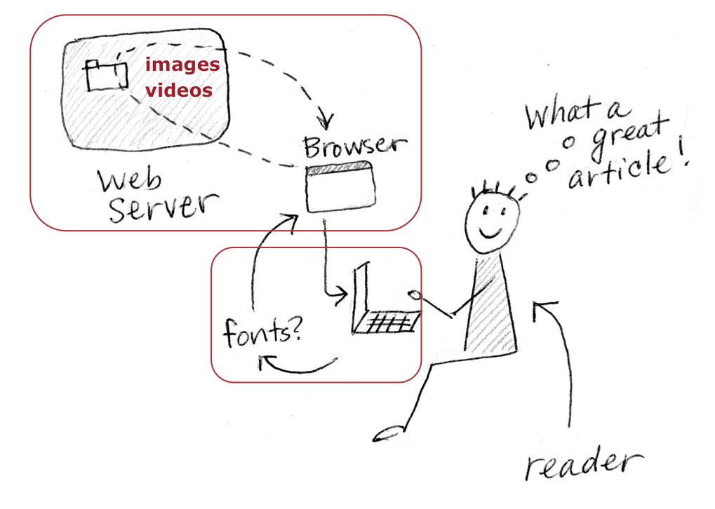
By default, fonts used in a web page are pulled from the reader’s font library on their computer.
Web safe fonts are fonts we consider “safe” to use. We know most people will have the font on their device. In order to make sure your web pages won’t revert to a default font (often set to Times New Roman), it’s crucial you use web safe fonts.
There aren’t many web safe fonts to work with:
- Georgia
- Verdana
- Times New Roman
- Arial
- Trebuchet MS
- Impact
- Courier
- Comic Sans MS
A good typographer can work with the same web safe fonts over and over, making them sing every time. Building a font library beyond web safe fonts is not strictly necessary.
You’ll use web safe fonts in the first few lessons.
Web Fonts
Web fonts are fonts that have been saved in a format for the web. They can be accessed from a server via the @font-face declaration (which you’ll learn how to use later). There are hundreds of web fonts available. Not all of them are appropriate for text.
The Assignment
- Download the PDF of fonts provided. Each font includes the letters a, b, e, f, o, p set at 150pt size.
- Using a sharpened pencil, carefully trace the top font in each group: Times New Roman, Arial, Futura STD (a print font) and Minion Pro (a print font). As you trace the letters, notice the bowl, x-height, terminal, aperture, serif (if any), and letterspacing. Note: If you don’t have tracing paper, put a clean sheet of plain paper over the fonts to be traced and use a window as a drawing surface. The light from outside will help you see the letters you’re tracing.
- Compare the fonts by sliding the tracings over other fonts on the page (again, if necessary, use a window in order to see both the tracings and the fonts behind them). If you want to, you can trace more fonts, or even compare tracings to the fonts on other pages.
- Write about what you see. Choose any two fonts, and note the differences between their bowls, x-heights, terminals, apertures, serifs (if any), and letterspacing. Write about any other differences you see, as well as any consistencies. A great way to build your analytical skills is to write down your observations. Writing forces you to slow down, notice details, and practice your vocabulary. Build your vocabulary for describing fonts and defending font choices.
Application to Web Typography
It might seem odd that I’ve asked you to trace letters for the first exercise. But all the fonts provided in this exercise (except the two print fonts) are appropriate for text on the web. When looking for a new font, try tracing the abefop at 150pt size and comparing the letters to the ones provided. Look at the new font’s bowl, aperture, letterspacing, and so on. This will help you pick a legible font with:
- A generous x-height
- Open apertures
- Prominent ascenders and descenders
- Slightly loose letter spacing
- Discernible terminals
