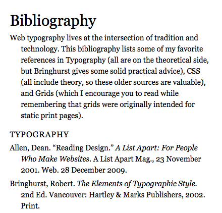
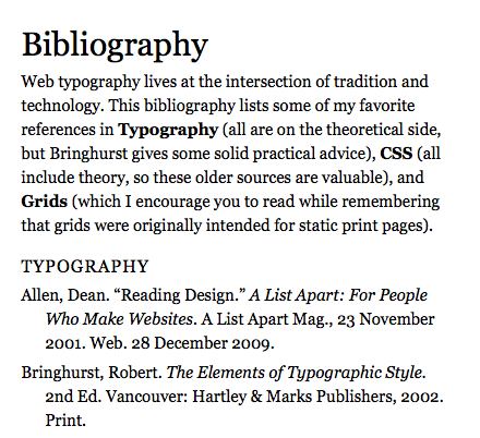
In this lesson, you will use h1 and h2 as intended. You will also use p, text-indent, margin, padding, <em>, <strong>, and a class.
Typographically, you will practice choosing a font based on what it has to offer: roman, italic, bold, caps, and numbers.
Overview of Part One of the Assignment
In this part of the lesson, you’ll create a bibliography with section headings and italicized titles.
- Use the text file 3_bibliography.doc provided.
- Typeset the bibliography, using either the Verdana or Georgia font family. Use only one font family.
- Write about what you see. Analyze the caps, numbers, bold, and italic. Does your font provide emphasis and contrast within the family? Do the counterforms start to fill in? What kind of numbers does your font have (lining or old style)? Feel free to use colloquial terms, like “gets lost” or “stands out.”
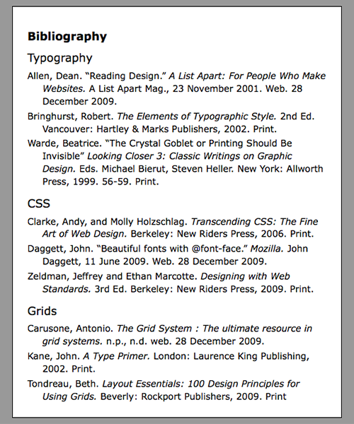
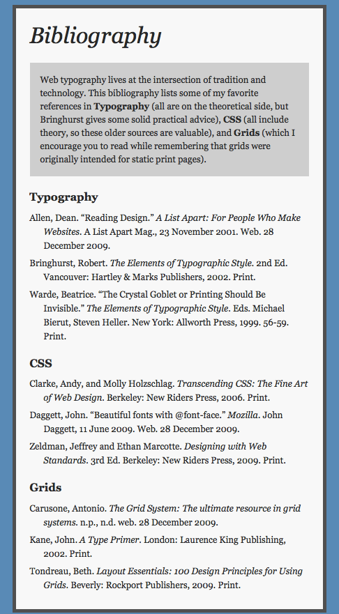
Working with the text provided, Chris Nelson designed this Bibliography (Part One only) using Verdana.
Getting Started
Create a Folder
In the web_typography_yourlastname folder, create a folder for the lesson. Call it bibliography.
Use this HTML File
Every HTML file needs the same basic syntax.<!DOCTYPE html>
<html>
<head>
<title>Bibliography</title>
<meta charset="utf-8">
<link href="bibliography.css" rel="stylesheet" type="text/css">
</head>
<body>
<div id="main_container"><!-- STARTS THE MAIN CONTAINER -->
</div><!-- ENDS THE MAIN CONTAINER -->
</body>
</html>
Add the Content
Between the <div></div> tags, paste the text from 3_bibliography.doc.
View Your Web Page
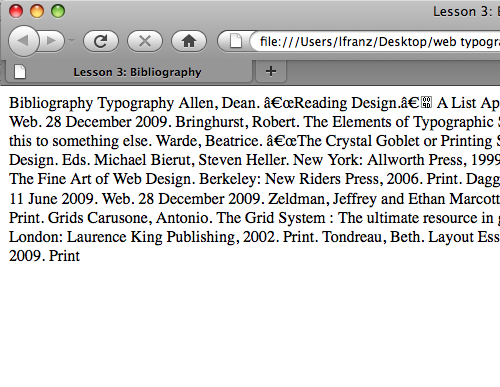
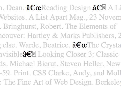
Without h1, h2, and p tags, the text runs together.Quotation marks from the Word document might flow in as weird syntax, which you will fix later.
Define the Text Elements
You’ll use a variety of tags to organize the text. First, identify the main heading (Bibliography) and wrap it in h1 tags, as follows:
<h1>Bibliography</h1>
Identify and define each subheading (Typography, CSS, and Grids) with h2 tags:
<h2>Typography</h2>
<h2>CSS</h2>
<h2>Grids</h2>
Identify and define each of the nine items (book, article, or blog) with p tags:
<p>Allen, Dean. "Reading Design." A List
Apart: For People Who Make Websites. A
List Apart Mag., 23 November 2001. Web.
28 December 2009.</p>
Save Your HTML Document and View the Changes
The bibliography should now have a main heading,three identical subheadings, and nine individual items.
You still need to fix some things, though.
Start Writing the CSS File
Create a new document in your text editor, and save it as bibliography.css in your bibliography folder. Use the universal selector (*) to set all margins and padding to 0. If you can’t remember how to use the universal selector, use the CSS cheat sheet (2017) provided. If you need more help, follow the instructions covered earlier in the Word Connotations lesson.
Describe the div ID
The bibliography is inside the #main_container div.This div helps control line-length by “containing” the text. To start, try making your main_container a white rectangle (400px wide) with a black border (1px), centered in the browser.
Remember, you describe an ID by setting up the element like so:
#main_container{
}
If you can’t remember how to style the div, that’s OK! You’re just getting started, and writing syntax takes practice. Remember, you can always use the CSS cheat sheet (2017) or follow instructions in the Word Connotations lesson.
Save Your Documents and View the Changes
If the name of your CSS file matches the name you linked to in the head of your HTML,you should see the text is now in a reasonable column. But it’s too close to the border of the div.
Add Padding to the Div
To give the text a little breathing room, add some padding (space inside an element) to the div. To add the same amount of padding all the way around (20px, for example), add the following syntax to the list of property:values; for the #main_container in CSS:
padding:20px;
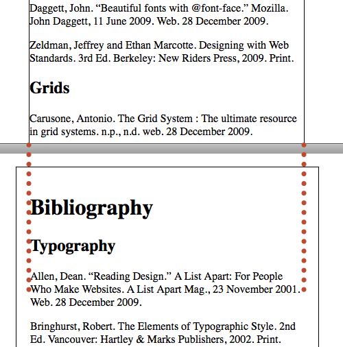
Top: Without padding, the text is right up against the border of the div. Bottom: With 20px padding all around, you have space between the text and the border of the div. Notice that the padding increased the amount of space occupied by the div. The 400px div now takes up 440px.
Now your #main_container syntax looks something like this (new syntax in bold):
#main_container{
   width:400px;
   border-width:1px;
   border-style:solid;
   margin-top:20px;
   margin-right:auto;
   margin-left:auto;
   background-color:#ffffff;
   padding:20px;
   }
If you want to add different amounts of padding on each side, you can do that. Simply set a different padding for the top, right, bottom, and left sides:
padding-top:10px;
padding-right:20px;
padding-bottom:30px;
padding-left:40px;
Note: If you already know how to write CSS shorthand, feel free to use it instead. I don’t use shorthand in TWD exercises.
Style the p Element
With the div set properly, it’s time to attend to the typography. Continue working in your CSS file.
Style the p just like you styled the heading elements in the previous exercise. As always, start by setting up the element like so:
p{
}
Make your text look the way you want it to look. I use Georgia 15/22, but you might use a slightly different size, or you might even use Verdana. Write your syntax accordingly.
My text is Georgia 15/22px, left-aligned, with no spaces between the paragraphs. So my syntax looks like this:
p{
   font-family: georgia;
   font-size: 15px;
   line-height: 22px;
   }
Change the Left Margin to Outdent
Bibliographies are set so all lines except the first are indented.The first line of each item is “outdented,” or “hangs” out beyond the edge of the rest of the text.
To outdent/hang the first line, you add left margin to the text (moving all the text in a bit) and then remove the extra left margin on the first line only (so the first line “outdents”).
The p tag currently has a 0 margin all the way around (margin:0px; was set in the universal selector). You need to set the left margin to 22px, like so (new syntax in bold):
p{
	font-family: georgia;
	font-size: 15px;
	line-height: 22px;
	margin-left: 22px;
	}
This pushes all the text over 22px. Next, to remove the extra left margin on the first line only, add the following line:
text-indent: -22px;
You can add the text-indent syntax anywhere in the description of your p element. I prefer to put it immediately after margin-left, so I can quickly see their relationship. Your CSS syntax for the p tag now looks something like this:
p{
   font-family: georgia;
   font-size: 15px;
   line-height: 22px;
   margin-left: 22px;
   text-indent: -22px;
   }
Save Your HTML Document and View the Changes
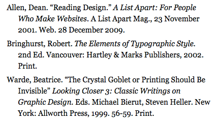
When you view your page in the browser, each of the nine items in the list has an outdent.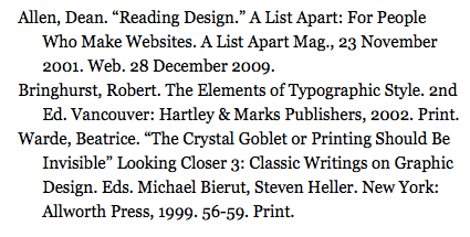
Each item in the list outdents on the first line. You added a left margin to the text, then removed it from the first line of each paragraph by using the text-index property. A common rule in typography is to set your indent equal to your line height. The line height in this example is 22px, so the left margin is also 22px.
Add a Bit of Space After Each Paragraph
The text looks fine with no space after it. The hanging first line of each paragraph helps chunk the text into items. But if you’d like to add a little space below each item, you can.Simply add in some bottom margin, like so (new syntax in bold):
p{
   font-family: georgia;
   font-size: 14px;
   line-height: 22px;
   margin-left: 22px;
   text-indent: -22px;
   margin-bottom: 5px;
   }
The browser will now apply the 5px margin to the bottom of each p element.
Italicize the Titles by Applying the <em> Element
Sometimes, you want to place emphasis on words within a line or paragraph of text. Heading tags and the p tag all automatically add a line break to the text. How do you emphasize one or more words without inserting a line break?
One way to do this is to use the <em> element. There are two kinds of “em” in HTML and CSS. One kind of em is a unit of measurement. The other kind — the kind you will use throughout TWD3 — stands for emphasis.
Apply <em> in the HTML
In the HTML file, add the following syntax around each book and website title:<em></em>
Don’t italicize titles of articles, which already use quotation marks. For example, here is the first title done for you (new syntax in bold):
<p>Allen, Dean. “Reading Design.” <em>A List Apart: For People Who
Make Websites.</em> A List Apart Mag., 23 November 2001. Web. 28 December
2009.</p>
Save Your HTML Document and View the Changes
After you save the document and refresh it in your browser, you’ll see that all the book and website titles are italicized.Styling the em in CSS is Not Necessary for This Exercise
Using em to italicize the titles worked.And you didn’t have to describe the em in CSS. Why? Because em is styled as font-style:italic; by default. You are using a web-safe font family with an italic version, and you want your emphasized text in italics, so you don’t have to touch the CSS.
Using em can be more flexible, and more complicated. You can use CSS to make the em look however you want it to. But for now, the em does exactly what you need it to do.
Fix the Quotation Marks
Even if the quotation marks look fine in your browser, you need to fix them so they’ll work correctly in all browsers. When you specified Georgia or Verdana, the quotation marks may have appeared to fix themselves, because both fonts recognize the smart (curly) quotes imported from the Microsoft Word document. But the quotation marks will still show up as weird syntax in some browsers. Go into your HTML, and replace all left quotation marks with the following code:
“
Then replace all right quotation marks with this code:
”
Save your file, and view your document in the browser to see the changes. I talk about quotation marks in detail in a later in TWD.
Describe Your Headings
The main heading
The main heading is Bibliography. This heading should stand out the most.Using the same font, try changing one typographic characteristic—size, weight, style, or case—to emphasize the heading. You can even describe margin and padding like you did for p in this lesson.
Remember, you start to describe a h1 by setting up the element like so:
h1{
}
If you can’t remember how to style an h1, use the CSS cheat sheet (2017) provided. If you need more help, follow the instructions covered earlier in the Word Connotations lesson.
The subheadings
The bibliography is separated into three sections: Typography, CSS, and Grids. These subheadings should stand out more than the text but not as much as the main heading.Again, try picking one way to emphasize the subheads: size, weight, or case. As always, start by setting up the element like so:
h2{
}
When your h1 and h2 are described, move on to part two of the exercise.
Part Two
Overview of Part Two of the Assignment
In this part of the lesson, you will add an introductory paragraph to the bibliography.
-
- Use the text file 3_bibliography_intro.doc provided.
- Typeset the introduction so it looks different from the rest of the text.
- Set three of the words in the introduction with strong emphasis.
Getting Started
In this part of the exercise, you modify the bibliography from part 1, so just continue working with the same files.
Add and Define the Intro Paragraph
After the main heading (Bibliography), but before the first h2 (Typography),paste the text from 3_bibliography_intro.doc. The new content is a paragraph of text, so make sure you define it by wrapping it in a pair of <p></p> tags (e.g., put the <p></p> tags around the paragraph).
Save Your HTML Document and View the Changes
The new paragraph is in place. But it is outdented — just like the bibliography items.Change the Introductory Paragraph
The introduction is a paragraph and is correctly defined as a paragraph, but it shouldn’t outdent. It’s not an item in the bibliography. You only have one p element to use in HTML, but you need two different styles of paragraphs.
How do you get around this problem? Create and apply a class to your introductory paragraph.
Create a Class in the CSS
In the CSS file, add the following syntax:.intro{
text-indent: 0px;
margin-left: 0px;
}
The class selector looks different from heading and p selectors because you’re not describing an element (h1, p, div)… you’re describing a class that can be applied to an element. To create and describe a class in CSS, you must precede the name with a dot (.). Thus the class selector becomes .intro.
I’ve named the class “intro” because it will be applied to the intro paragraph. In HTML and CSS, you can name classes whatever you want to. Just make sure the class name in your HTML matches the class name in your CSS.
Apply the Class in the HTML
To apply a class to an element in HTML, add the class (don’t include the dot) to the element.In this lesson, apply the class to the opening <p> tag for the introductory paragraph. Your syntax should look like this:
<p class="intro"> Web typography lives at the intersection of
tradition and technology. Thus, web typographers can learn… </p>
Notice the ending tag remains the same:
</p>
When the paragraph ends, the class ends with it!
Save Your Files and View the Changes
The introductory paragraph no longer has an outdent,and the text of the paragraph lines up with the headings!
The Difference Between Class and ID
You wanted to make a paragraph with a different style, so you applied a class (.intro) to it.But you’re also using a div that you styled by applying an ID (#main_container) to it. What’s the difference?
An ID is unique and can only be used once in a document. A class can be used over and over again in the same document.
Emphasize Some Words by Applying the <strong> Element
Sometimes you want to place more emphasis on words within a line or paragraph of text. You’ve already used the <em> element to italicize titles in the bibliography listing. Now you’ll apply <strong> to make other words pop out of the introductory paragraph.
Apply <strong> in the HTML
In the HTML file,add the following syntax around the words Typography, CSS, and Grids in the introductory paragraph (NOT the headings!):
<strong></strong>
For example, here is the first word done for you:
… some of my favorite references in <strong>Typography</strong> (all are on
the theoretical side, …
Save Your HTML Document and View the Changes
The words are now bold.Style the <strong> in CSS so it Works with Your Text
Strong is styled as font-weight:bold; by default.If you are using a web-safe font family with a bold version, and you want your strongly emphasized words in bold, you don’t have to touch the CSS.
Of course, if you don’t want your strongly emphasized words in bold, you can change the way they look. For example, I think bold is too strong for my layout; I’m not using bold anywhere else on the page. I’d rather my strongly emphasized words mimic the h2.
Style the <strong> just like you styled the other text elements. Apply case, weight, and style as needed. For example, I want my strong elements to be normal weight, all caps, with 1px letter-spacing, so I wrote the syntax like this:
strong{
   font-weight: normal;
   text-transform: uppercase;
   letter-spacing: 1px;
   }
Save Your Files and View the Changes
The strongly emphasized words have changed.
Validate your Files
Once you have your strongly emphasized words looking they way you want them to, validate your files. Use validator.w3.org for your HTML, and jigsaw.w3.org/css-validator for your CSS.
Always validate your files. Even if I don’t tell you to.
Quick Tips
CSS Resources
- Problems? Check out my Frequently Asked Questions page.
- Need syntax for a property I haven’t covered? Try HTML Dog.
- Want a CSS cheat sheet (2017) at your side? Just download and print!
Project Resources
- Get the Bibliography text for the first part of the lesson.
- Get the Intro text for the second part of the lesson.
