Beware! Not all web fonts are designed for the screen. Not all fonts are legally licensed for use on the web. Just because a font has been saved into a format for use with @font-face, that doesn’t mean it’s a good, legal, web font.
You already know what to look for in a font (strokes, spaces, weights, styles). But how do you find a good quality web font when there are so many options?
A colleague (Steve Hickey over at Fresh Tilled Soil) suggests looking for a font with a large family of weights and styles. These larger font families are often designed by a type designer and are more likely to hold up in various contexts. But that doesn’t mean smaller font families are out of the question.
Test the Font in Context
When you have thousands of web fonts to choose from, you need to ascertain which ones will work best for you. Which ones will work for a particular project.
Some Web Font Providers Test in Context
Fontdeck, Fontspring, Font Squirrel, Typekit, and MyFonts offer the opportunity to test-drive Web fonts in a sentence. The problem with a sentence is that it doesn’t show how the font looks in body copy. Body copy has visual texture, and texture can be pleasing (lively but not intrusive, promoting horizontal movement of the eye) or jarring (with uneven spaces or a strong vertical pull, hindering horizontal movement of the eye). Texture affects readability.

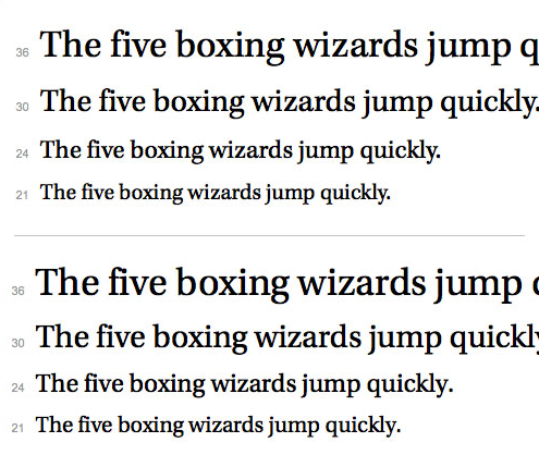
Cascading sentences from Typekit. Top: Kepler Standard by Adobe. Bottom: Utopia Standard by Adobe. Both are serif fonts with a slightly oval bowl (look at the shape of the “o”) and a high contrast between thick and thin strokes. They look pretty similar to the casual eye. Heck, they even look pretty similar to the trained eye!

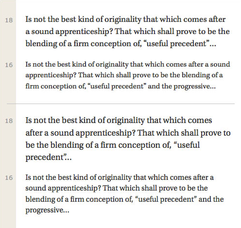
The same fonts set in paragraphs from Typekit. It’s easier to see the difference. Top: Kepler Standard by Adobe. Kepler has a rounder, “bubblier” feel and looks slightly smaller when set at body-copy sizes. Bottom: Utopia Standard by Adobe. Utopia feels more structured, less round. And, of course, it looks bigger when set at body-copy sizes. Neither of these fonts is “wrong” when set in text. But they look different in paragraphs, and each might be appropriate for different projects.
Google Fonts, Fonts.com, Webtype, Typekit, and Hoefler & Co show their fonts in paragraphs. But not all of the paragraphs are as helpful as they could be.
Fonts.com doesn’t offer enough text sizes: they show 14px and 18px, but not 16px (which is a really popular type size for Web text). Webtype uses a string of capitalized words, so there are too many capital letters and it’s hard to see what real text would look like. Hoefler & Co’s paragraphs are limited to three lines, with a super-long 725-pixel line length; these paragraphs are too long to read. Google Fonts has a too-tight line height, so all the fonts look clunky.

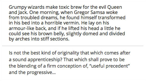
Which font would you choose? How paragraphs are shown in context makes a difference. Top: Open Sans on Google Fonts. A tight line height creates text that is clunky and hard to read, making it hard to tell whether the font would look good in body copy. Bottom: Open Sans on Typekit. A looser line height helps you see that the same font is actually a pleasure to read.
Do Your Own Testing
Of all the web font providers I’m familiar with, I prefer how Typekit shows their fonts in context. When I use their fonts, I can quickly dismiss fonts that won’t work for my project, while making note of the fonts that might work.
No matter what web font provider you use, when you find a font that looks like it might work, take the time to test it in context of the actual project. Each text has unique needs.
Test the Font Cross Browser
Web designs are ephemeral, constantly changing based on operating system, browser and screen size. And fonts behave differently cross-browser — if they aren’t hinted correctly, then letter shapes, strokes and letter spacing will change in unexpected ways.

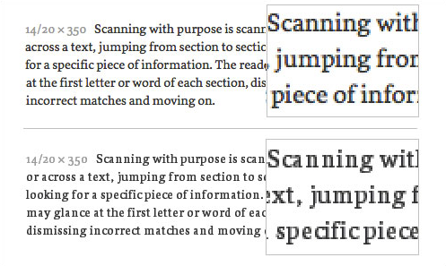
If fonts aren’t hinted well, then spacing (both inside and between letters) can change significantly from browser to browser. Top: This font looked great on my Mac. Bottom: When I tested it cross-browser, I ran into problems. The font gets narrower, and the spacing between letters is erratic.
Some Web Font Providers Test Cross Browser
The only way to know whether a font will work cross-browser is to test it. And testing web fonts is mind-numbing and time-consuming.
Luckily, Fonts.com, MyFonts and Typekit provide screenshots of their fonts in different browsers. They only show cascading sentences, but even that helps identify which fonts to reject and which to consider for further testing.
Hoefler & Co claims their Cloud.typography service creates multiple font files (each hinted and built for a specific browser and platform) and supplies each browser with a unique font file. If this is true, then their fonts should look great across all browsers.
Do Your Own Testing
Again, of all the Web font providers I’m familiar with, I prefer how Typekit shows their fonts cross browser. It’s not perfect, but I can quickly dismiss fonts that don’t work.
Even when you find a font that looks like it will work cross browser, I recommend you take the time to test it yourself. I test fonts cross browser with a template at the start of the project. That way, I can see how the font works at various sizes, line-heights, line lengths, weights, and styles… before I fall in love with it for my project.
When I find a font that works cross browser, I post the template at goodwebfonts.com. Feel free to copy and use the template (or make your own) for testing fonts you’re interested in using.
There are multiple online cross browser testing sites available to help with the process. I use crossbrowsertesting.com. I like that their system runs on real devices, so I get an accurate view of how the web fonts render cross browser. Take the time to find a service that meets your needs and your budget.
You will most likely have to manually load and test web fonts you’re interested in using. Automated screenshots save time, but are often taken immediately upon page loading. Before the web font has a chance to load! If you are using a service that provides automated screen shots, and the results suggest the web font is not loading, this may be the culprit. Go back and do a manual test to confirm.
A good web font is legible, has all the weights and styles you need, looks great on your devices, but also holds up across other devices.
Quick Tips
When looking for a good web font, look at your options…
- In context. What will it look like in text? Is it right for your project?
- Cross browser. What will it look like on various devices and operating systems? Do letters or spacing get all wonky?
If you want to learn more about choosing a good web font, I recommend…
- “Dear Web Font Providers” by Laura Franz
- “Choosing and Using Web Fonts” by Laura Franz