This page is incomplete. It needs context and editing.
Choose a Website to Analyze:
(chosen for their 2015 webby awards for navigation)
- http://genelab.nasa.gov/index.html
- https://designmuseum.org/
As you experience each kind of “page” figure out the navigation
- Click on every link in the navigation bar(s) if any. Where do they go?
- Click on every link in the text (if any). Where do they go?
- Click on every link in the footer (if any). Where do they go?
- Are there any links that annoy you? Why?
- Are there any pages where the navigation (within the page or between pages/sites)
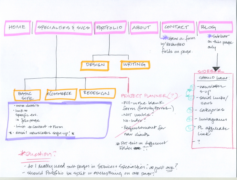
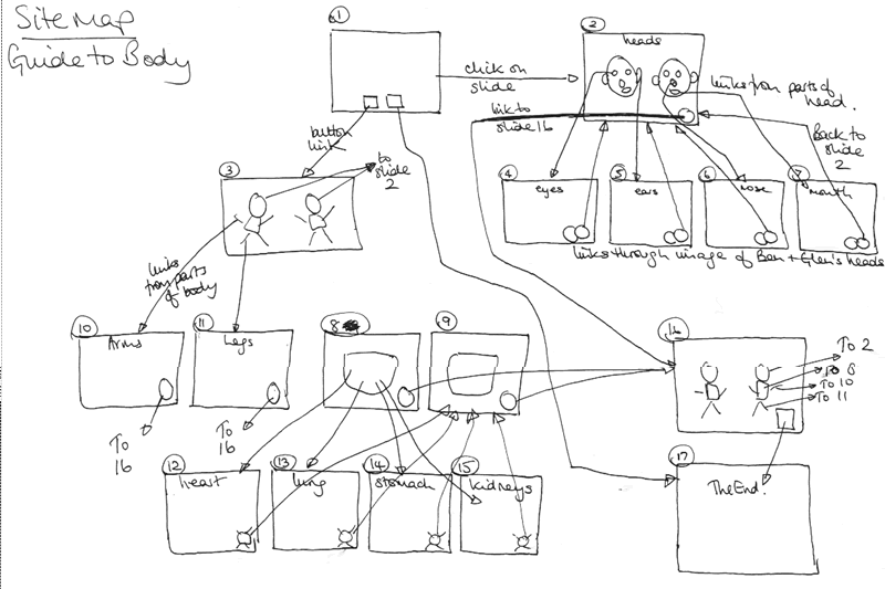
annoys you? Why? - NOTE Draw a simple diagram of the site (a site map). Use a pencil so you can erase. Make sure you name each box/page as you draw it. (What are things linking to?) Using lines and arrows, show us which pages are connected to each other in the site. Are there any dead-end pages (need to back up to get out of them)? Is that OK? Using a different kinds of arrow, show us which links go to outside sites. Feel free to add color as needed.
Example Site Maps (hand drawn is good!)

From maripfeiffer.com
