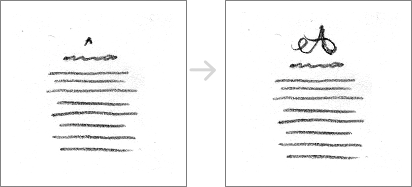
If you listen to music, watch films, or enjoy art, you already have experience with rhythm and tension.
Imagine a song with a rhythm that never changes (tap, tap, tap, tap, tap, tap, tap).
Pretty boring.
Imagine a song with a dynamic rhythm that shifts, contrasting changes in volume and pace. Some beats are soft; others are loud. Some come slowly; others, quickly. Sometimes, the beats stop altogether, and the rhythm falls silent, creating tension as we wait for the beats to start again (tap, tap, tappity-tap. BAH bah BAH BAH . . . . BAH!).
Like good music, successful dynamic typographic layouts—whether simple or complex—need a basic rhythm (created by repetition), counterpoints (created by contrast), and spatial tension (created by spatial relationships).
Repetition and Counterpoints
Text has an inherent rhythm created by the repetition of horizontal lines. This rhythm is created with a consistent use of font, size, line length, and line height.
To compose a dynamic rhythm, you need to break the basic horizontal repetition with counterpoints. Two fundamental counterpoints are the focal point and strong vertical lines.
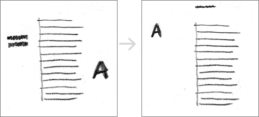
Left: Equal margins and competing focal points undermine rhythm and tension. Right: A single focal point and strong vertical line improve rhythm and tension.
Counterpoint One: The Focal Point
We understand our world in terms of contrasts: light and shadow, hot and cold, bitter and sweet. When an element contrasts with the rest of the composition, it becomes a focal point and acts as a counterpoint to the rhythm of the text.
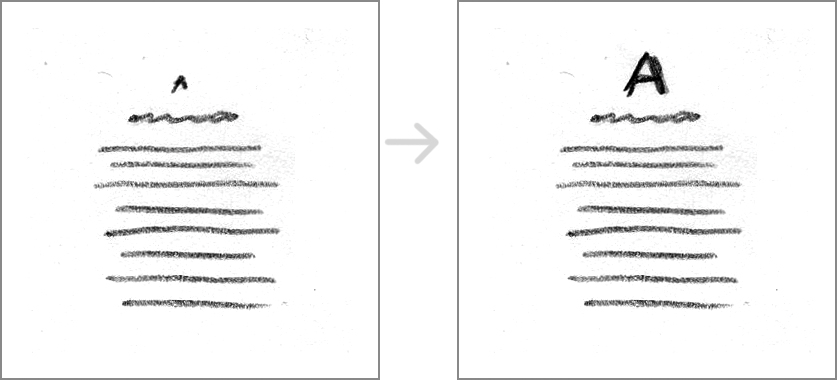
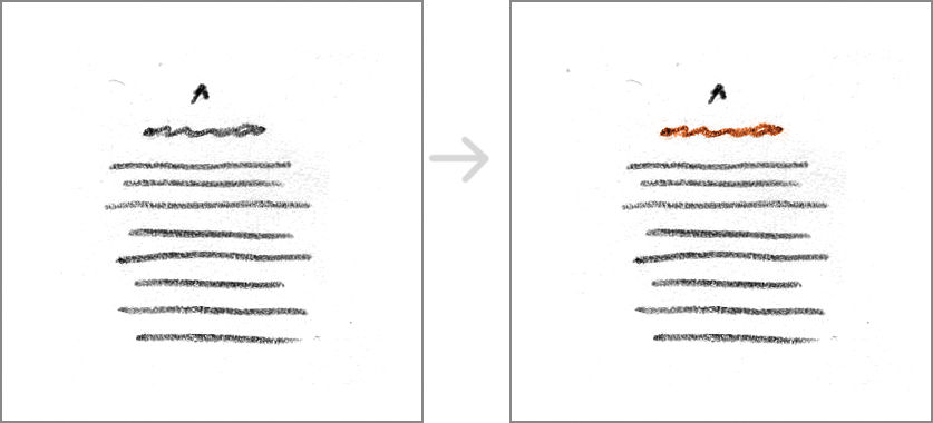
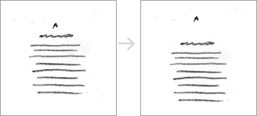
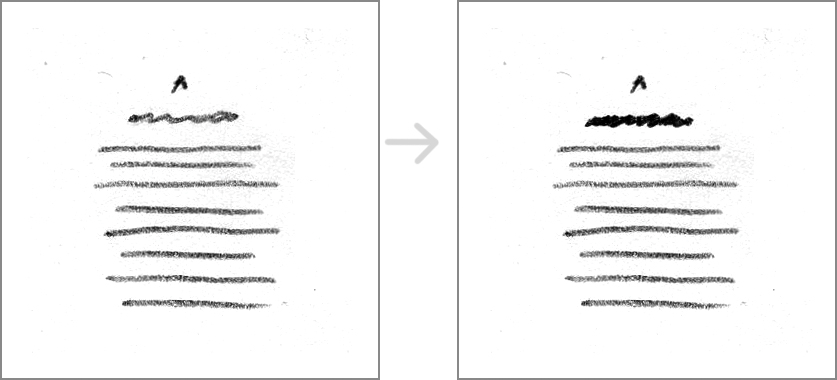
You can create contrast in many ways. Five common methods are size, color, space, weight, and shape.
Contrast of size: An element (letter, word, title, sentence, or paragraph) is bigger or smaller than the others.
Contrast of color: An element is brighter, darker, or a different hue from the others.
Contrast of space: An element is on its own, away from the others. Two or more elements are bundled, creating a physical relationship apart from the others.
Contrast of weight: An element is heavier/bolder (or thinner/lighter) than the others.
Contrast of shape or form: An element has a different shape or form from the others. Shape/form can refer to the form of a font or the shape of a text block.
Tips for Creating a Good Focal Point
These methods for creating contrast are hard to separate from one another; for example, you can create a focal point by making an element big (size) and placing it apart from the rest of the elements on the page (space). The trick is: don’t use all the methods at once.
If everything is emphasized, nothing stands out. Contrast works best when a limited number of elements are emphasized.For a counterpoint to work, you must have the repetition of the other elements. A song with nothing but contrasts in tone, volume, and rhythms becomes chaotic. The same is true of typographic layouts.
Avoid making shapes with text blocks. Text blocks that say, “Hey, look at me—I’m a triangle!” are similar to fonts that say, “Hey, look at me—my i is dotted with a heart!” Remember that the words themselves communicate the message. You only undermine the text by drawing the reader’s attention to oddly shaped text blocks.
Counterpoint Two: Strong Vertical Lines
We see our world in terms of lines: horizontal (the horizon) and vertical (what grows up from the horizon, either natural or manmade). When a strong vertical line acts as a counterpoint to the horizontal rhythm of text, the typographic layout becomes more dynamic.
You can create a strong vertical line in many ways. Four common methods are alignment, creating a gutter, continuation, and shape. Again, you’ll find that the methods for creating strong vertical lines are hard to separate from one another; often, you’ll use two or three at the same time.
Alignment: A visible vertical line is created between the even edge of the text and the white space surrounding it.
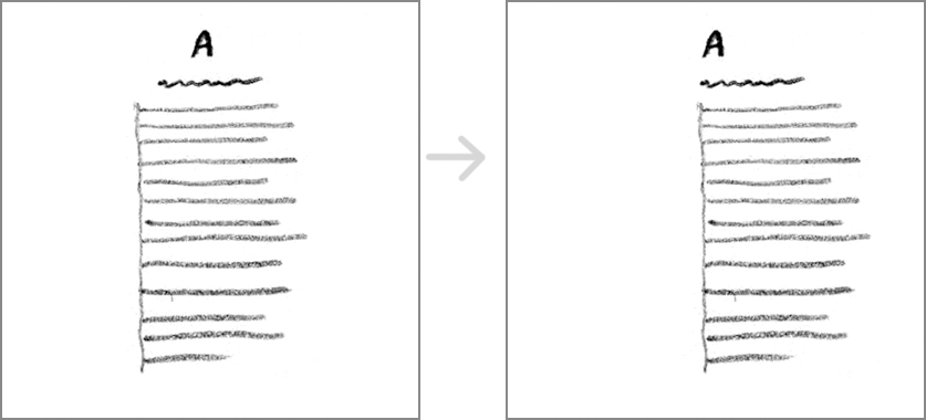
Left: A layout with a vertical line. Right: Aligning all the elements (and slightly shifting the text block) emphasizes the vertical line.
Gutter: A visible vertical line is created when two text blocks with even edges are bundled. A gutter is the white space between the text blocks. The narrower the space, the stronger the vertical line. When working with two columns of text, always keep your gutter a bit wider than your line height; this keeps the two columns from blending into a single column.

Left: A layout with a vertical line. Right: A narrow gutter and continuation work together to emphasize the vertical line.
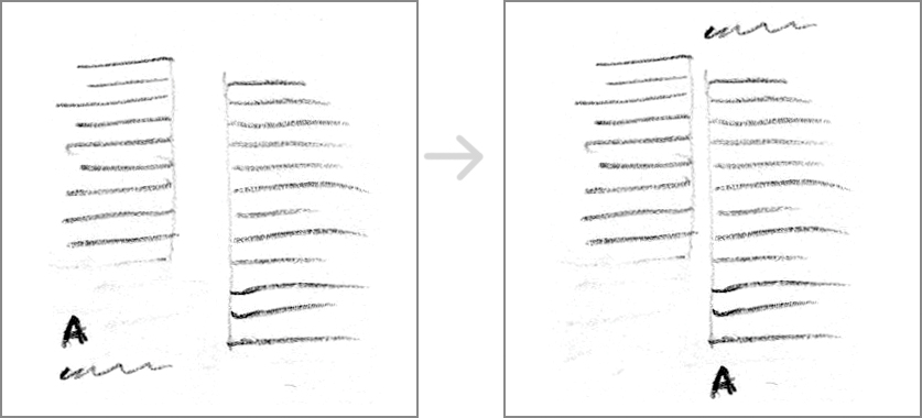
Left: A layout with a vertical line. Right: Tightening the gutter (and moving elements out of the corner) emphasizes the vertical line.
Continuation: An invisible vertical line is created when two or more elements are lined up along the same line. Continuation is a principle of how we read objects: Any line tends to be seen as continuing in its original direction. Use continuation to extend the visible vertical lines created by alignment and gutters.
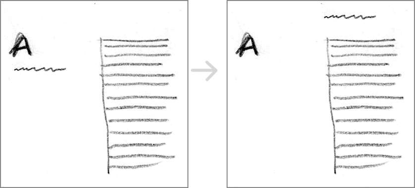
Left: A layout with a vertical line. Right: Moving one element creates continuation. It turns a side-by-side layout into one with a strong vertical line coupled with a strong focal point.
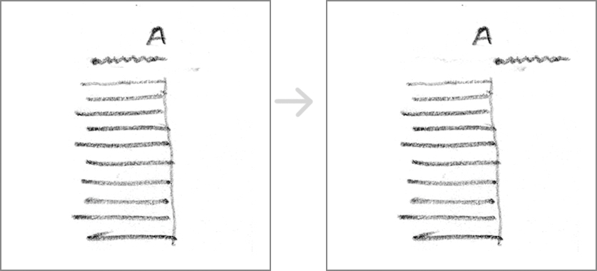
Left: A layout with a vertical line created using continuation. Right: Moving one element further emphasizes the invisible vertical line.
Shapes of text blocks: A vertical shape is created when text blocks are long and narrow. Vertical text blocks are the weakest method for creating a vertical line. You’ll find that you need to pair this method with alignment and gutters to achieve a good counterpoint to the horizontal rhythm of the text.
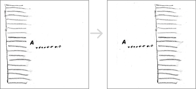
Left: A layout with a vertical text box. Right: Moving the vertical text block away from the edge emphasizes the vertical line created by the even edge of the text.
Spatial Tension
Even with a focal point and a strong vertical line, compositions can still feel static if you don’t pay attention to the space around the elements.
You can create spatial tension in many ways. Six methods are: avoid the center, create a sense of direction, create unequal shapes/margins, contrast the sizes of white shapes, consider the z-axis, and consider the edges.
Avoid the center. Place your focal point and/or your strong vertical line off-center. Centering a strong element creates balance and stability, which you may not always want.
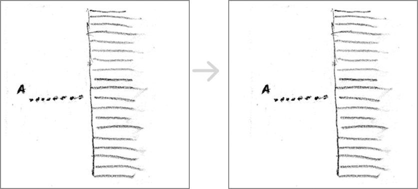
Left: A good start, but the vertical line is centered. Right: Shifting the entire composition to the right improves spatial tension.
Create a sense of direction. Directional movement tends to start at the edge of a page. Vertical movement starts at the top edge; horizontal movement starts on one side or the other.
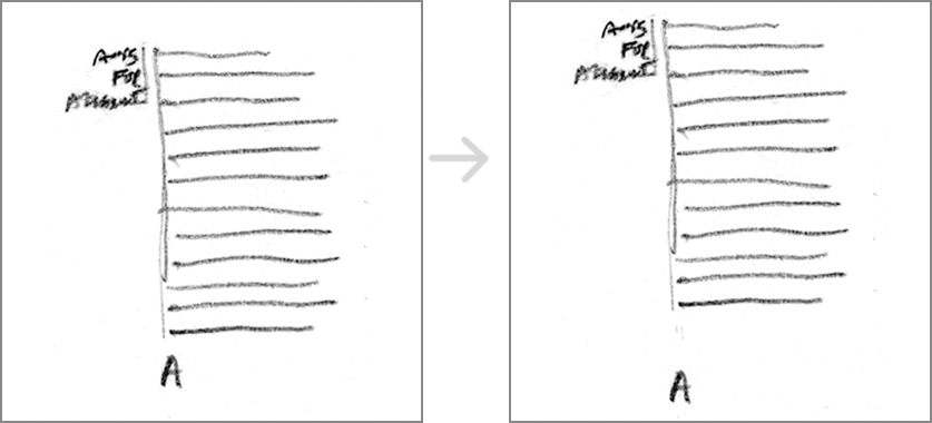
Left: A good start, but the composition feels clustered in the center of the page. Right: Using a tighter top and bottom margin helps create vertical movement on the page.
Create unequal shapes/margins. Use your white space as a counterpoint to the rhythm of the text. When appropriate, keep space at the top, right, bottom, and left of the composition unequal. Avoid creating white spaces equal to the sizes and shapes of other elements, such as text blocks or titles.

Left: A good start, but the text block is the same size as the right margin. Right: Shifting the entire composition to the right improves spatial tension.
Contrast the sizes of white shapes. Contrasting large and small white spaces creates a more dynamic composition than repeating a midsize white space does.
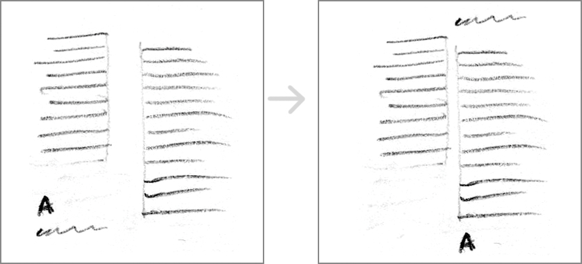
Left: The white spaces (top, right, bottom, and left margins; the gutter) are almost equal. Right: Shifting elements to create contrast between large and small white spaces improves spatial tension.
Consider the z-axis. When working in two dimensions, you can suggest a third dimension by changing size (smaller, more tightly spaced elements look farther away), opacity (lighter elements recede), and intensity (dull elements recede, while brightly colored elements come forward).
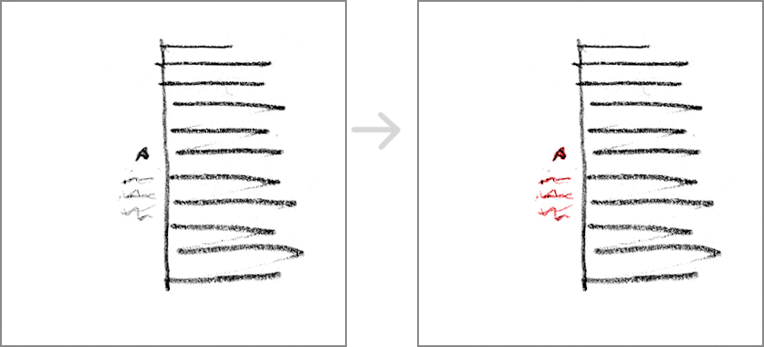
Left: The use of space and the gutter help create a strong vertical line. Right: Using a bright color brings the small text forward and helps create spatial tension.
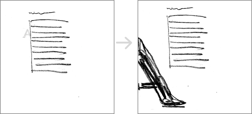
Left: The letter A recedes because it’s small, light, and cropped by the text box. Right: The letter A comes forward because it’s big, dark, and cropped by the outside edge. In both versions, the use of the z-axis helps create spatial tension.
Consider the edges. The edges help define space (2D and 3D), define margins, and suggest direction/motion. Don’t let the edges go to waste or disappear; they’re valuable elements!

Left: Clustering the composition in the center of the page doesn’t take advantage of the edges. Right: Using a tight top edge makes the text feels like it’s hanging from the top, creating spatial tension.

Left: A good use of unequal shapes/margins. Right: The letter A is cropped by the outside edge. The use of the left edge helps create spatial tension.
Tips for Creating Dynamic Compositions
The methods for creating spatial tension are hard to separate from one another; often, you’ll use two or more at the same time. Use as many as you need to.
Keep your balance. Dynamic compositions still need balance. Balance is a product of visual weight (size, weight, color, and shape) and placement. If the layout feels like it wants to fall off the page, keep rearranging the elements, increasing or decreasing their visual weight as needed to create balance.
Quick Tips
Create counterpoints to the horizontal rhythm of the text by:
- Creating a focal point with contrast (size, color, space, weight, and shape).
- Creating strong vertical lines with alignment, gutters, continuation, and the shape of text blocks.
Create spatial tension in a layout by:
- Avoiding the center.
- Creating a sense of direction.
- Using unequal margins.
- Contrasting the sizes of white spaces.
- Considering the edges.
- Considering the z-axis (depth).
