The Modernist page was a product of World War I. German designers—having lived for years in a country at war—wanted to help create a better society. They did not want to look back, and condemned classical typographers for doing so. Inspired by new technologies and the systematic approach to mass production, Modernist typographers believed in clarity of form as opposed to beauty.
German printer Jan Tschichold, believing in the tenets of Modernism, published The New Typography in 1928. The rise of Modernism in typography is attributed to his writings, which influenced decades of typographers. Later, after being imprisoned by the Nazis and later escaping to Basel, Tschichold renounced his views on Modernism. He returned to working in a more classical manner.
The period after World War II saw the rise of the International Typographic Style, which influenced corporate design well into the 1960s. Although formally similar to Modernist typography, the International Typographic Style lacks the dogmatic search for clarity and truth.
Contemporary typographers move freely between the classical and modernist styles. But in the early 1930s a heated debate waged over which was the “one true approach.” Philip Meggs wrote in his introduction to Texts on Type: Critical Writings on Typography, “Artistic struggles are seldom limited to disagreements about what constitutes the noble virtues of beauty and truth… Underlying the conflict are concerns about economic survival: Who will get the work?”
Characteristics of Modernist Pages
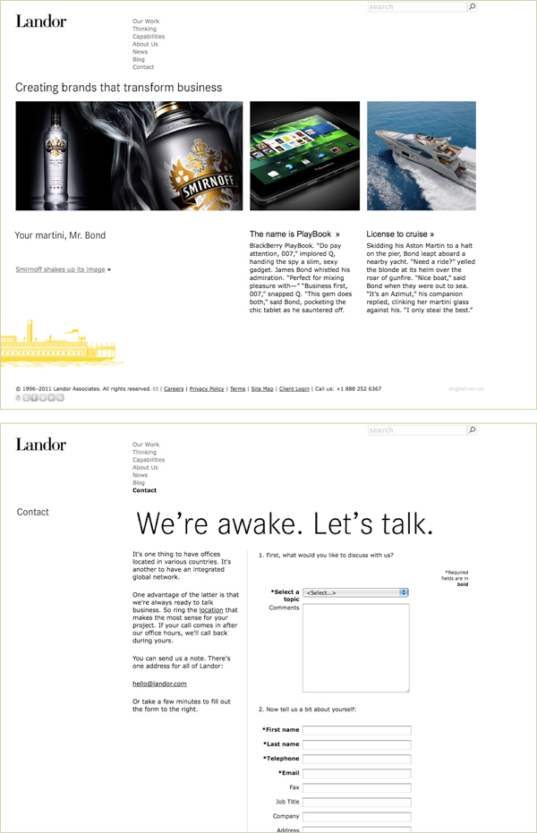
Modernist Pages Used Space in an Architectural Manner
The text frame of the classical approach is gone. Text blocks can live anywhere on the page and are spatially related to each other via the grid. White shapes (not just gutters and margins) are equally important architectural elements.
While there is no “rule” against this approach, most websites don’t use a structure with a lot of white space—they use as much of the screen as possible.

Top: Landor Associates (landor.com, circa 2012) used space in an architectural manner. The layout was asymmetrical; white shapes and blocks of text were equally important formal elements. Bottom: The site used a grid of vertical and horizontal alignments to place text and information. Notice the repetition of the strong horizontal line, created by images on the homepage and a main headline on the contact page.
Modernist Pages Used Sans Serif Fonts
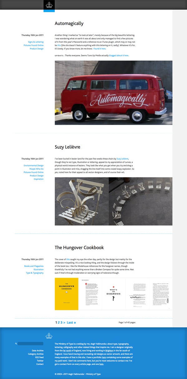
Sans serif fonts were used sparingly before they found favor on the Modernist page. Jan Tschichold wrote in The New Typography, “Our age is characterized by an all-out search for clarity and truth, for purity of appearance. So the problem of what typeface to use is necessarily different from what it was in previous times. We require from type plainness, clarity, the rejection of everything that is superfluous.”

The Ministry of Type uses Modernist typographic elements. The page is asymmetrical, the font is sans serif (Bliss Pro, a typeface designed by Jeremy Tankard), and color is used to guide the reader’s eye down and across each entry.
Modernist Pages Used Contrast to Create Emphasis
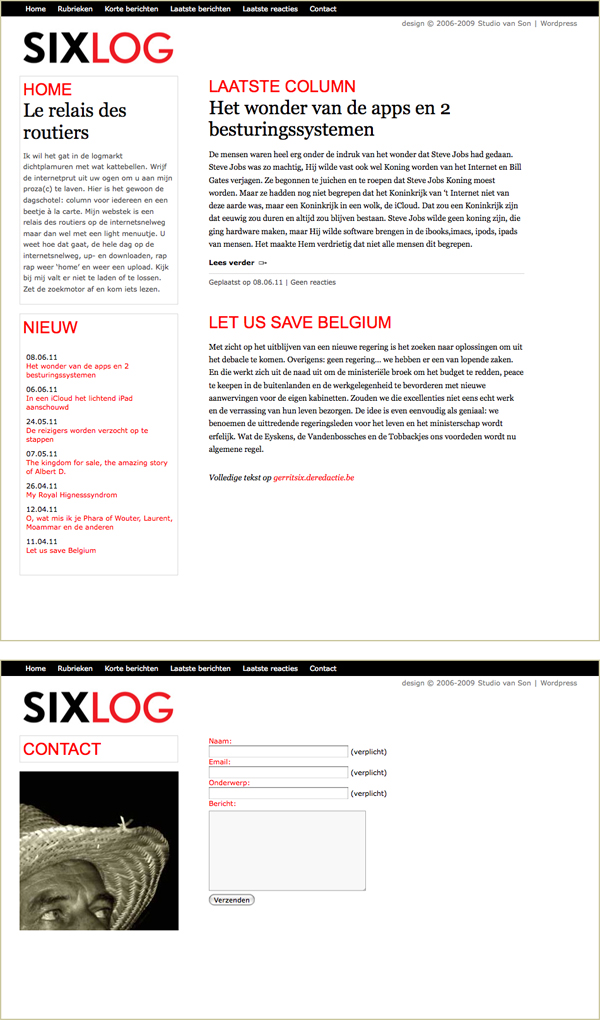
Text on the Modernist typographic page was meant to be glanced at quickly, with readers deciding what to read of the text, if any. Thus, hierarchy was created via placement, size, and weight. Different levels of emphasis guide readers around the page.

SixLog (designed by Studio van Son, circa 2012, now archived) Top: The page structure was less architectural, and the body font was serif. But the use of big red type to lead the reader’s eye helped chunk the text and make it easier to skim. This is a modernist approach to hierarchy. Bottom: The contact page adhered to the grid system; the image was cropped into a square.

Design Intellection (circa 2012, no longer active) used contrast of space, contrast of size, and a strong vertical edge to guide their readers’ eyes. Contrast of weight (regular to bold) along with horizontal rule lines helped chunk information. Screenshot from mediaqueri.es.
Modernist Pages Convey an Asymmetric, Lively Feeling
Text on the modernist page is neither centered nor justified. Modernist typographers railed against symmetry as an aesthetic form determined by previous typographers. Asymmetry was considered more logical (chunking text for readers) and a better expression of modern life.
The Role of the Typographer
A classical typographer would say, “Here is an important text; I’ve set it in a pleasing manner so the reader can enjoy and contemplate it.” A modernist typographer, on the other hand, would say, “People don’t read in a leisurely manner anymore. This text might be important to readers, so I’ve used emphasis and space to help people skim it, then read what is most important to them.”
Modernist typographers interpreted texts, breaking them down and deciding what to emphasize—determining how to guide the reader’s eye. Done in the name of clarity and truth, the movement also marks a shift in the typographer’s relationship to the text: from scribe to editor.
Quick Tips
When designing the page, you can reference the work of those that came before.
Remember the modernist page…
- Tended to use a grid to create architectural space.
- Tended to use sans serif fonts, contrast to create emphasis, and asymmetry to guide a reader’s eye.
- Has rhythm, clarity, and obvious contrasts.
- May have rule lines when necessary to communicate the text clearly.
- Was designed by typographers who believed the careful use of type, space, and contrasts could help readers ascertain the content of a text at a glance. These typographers believed that by promoting clarity, truth, and purity of appearance, they could influence society and embrace the future.