The Post-Modernist page emerged in the 1980s. Influenced by the typographic experimentation of New Wave design in the 1970s, Post-Modern typography was made manifest with the invention of personal computers and page layout software. Suddenly, Post-Modernist typographers could take apart (deconstruct) and re-build texts (to create meaningful or aesthetic relationships) in the comfort of their own studios.
Characteristics of Post-Modernist Pages
Post-Modernist Pages Used Text Anywhere on the Page
The Post-Modernist page used space in a hyper-architectural manner. Space became three- (and even four-) dimensional. Sometimes the z-axis was emphasized by layering text. Headings (or text) could be broken mid-word, leading readers to the next line. Sometimes text ran right off the page, perhaps to continue on the next page… or perhaps not.
In the image below from Typophile.com (circa 2012), posts and new stories are set in a Modernist fashion, using a sans serif font, weight:bold; for emphasis, and a clear layout. The background contains text representing language and time. Recent posts layer one upon the other. Older posts are lighter, fading into the distance. Big, incomplete sentences are not meant to be readable. Instead, they represent the presence of multiple voices collaborating on Typophile. Subheadings in red boxes create emphasis and lead readers into the text.
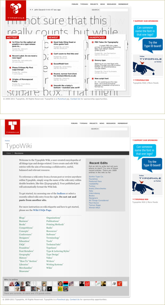
Typophile (typophile.com, circa 2012). Top: Text is layered. Posts are Modernist, while the background text is Post-Modernist and represents collaboration. Bottom: The Wiki section of the site. Using a serif font, large top and left margins, and italic for emphasis, the Wiki page is Traditional. Typophile shows how Traditional, Modernist, and Post-Modernist ideals can co-exist.
Post-Modernist Pages Use Any Font that Works
The Post-Modernist page may use serif or sans serif fonts, legible or illegible fonts. The purpose of the Post-Modernist page is to interpret the text and challenge the reader; the typographer uses whatever font she feels is most appropriate.
Post-Modernist Pages Use Contrast to Create Emphasis
Contrasts of space, texture, shape, and size are all used to create emphasis. Emphasis is used on the Modernist page to chunk information or lead a reader through the text. On the Post-Modernist page, it is often used to provide an entry point into the landscape of text. Where might the reader start?
Post-Modernist Pages Convey a Textural Feeling
Text on the Post-Modernist page is need not be centered nor justified. It need not be symmetrical nor asymmetrical. The relationship between text-and-text, text-and-image, and text-and-space is explored, captured, and shared.
In the image below, Misprinted Type (circa 2012) created the opportunity for readers to explore and discover images of text.
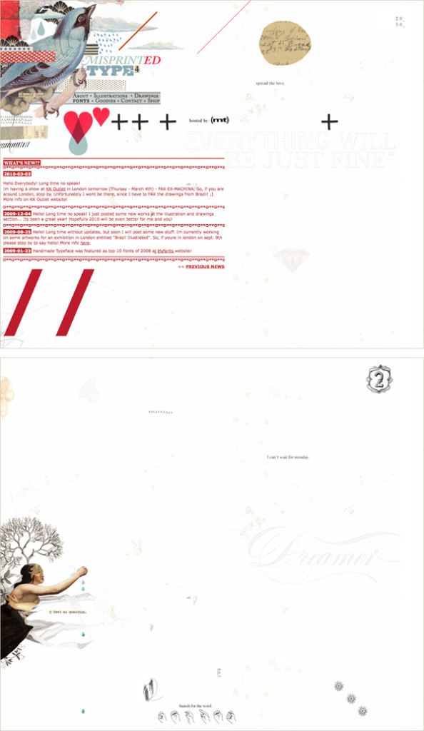
Misprinted Type (misprintedtype.com/v4, circa 2012). Top: Text is an extension of the image, while typographic characters are images unto themselves. Posts are set with texture in mind—the line height a little too tight, the line length a little too long. But the block of text mimics and balances the collage above it. Text is meant to be read, but comfort is sacrificed for form. Subheadings in red boxes create emphasis and lead readers into the text. Bottom: The same page scrolled down. Elements await discovery by the reader/explorer.
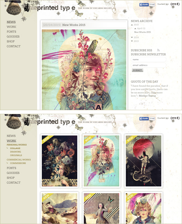
Misprinted Type (misprintedtype.com in 2015) is more structured, but continues to have some post-modern elements. Top: The header includes layered, textured type, while the text in the right-hand column is very light. Legibility is a secondary concern. Bottom: On lower-level pages, the site uses a strike-out, which usually means “this is no longer true” or “this is incorrect” to mean “you are here.”
Post-Modernist Pages Use Form to Convey Meaning
The Post-Modernist page is not merely a formal exercise, devoid of meaning. Formal explorations are often a search for a way to physically (viscerally) represent the meaning of a text. In the image below, Post Typography (posttypography.com, circa 2012) used a sea of words to communicate the diverse, vibrant work done in their studio.
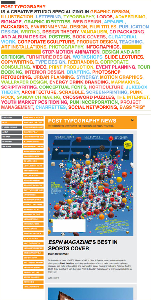
Post Typography (posttypography.com, circa 2012). Top: A sea of words covers the page, set for texture, not for legibility (too big, in all caps, with a tight line height). Color splits the text into manageable chunks, forming random categories. On a:hover, links become bands of color, concealing the words. The color bands create emphasis, and lead readers into the text. Bottom: In the News section of the site, where text is meant to be read, the typography is clear and legible.
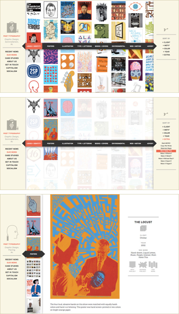
Post Typography (posttypography.com, 2015) is currently more image-focused, but with a similar theme (vibrant, diverse work). Top: Now a sea of images covers the page. Middle: A variety of categories can be selected by the visitor, some of which are decidedly irreverent (I’ve chosen “mom hates this”). Bottom: Lower level pages remain clear and legible.
The Role of the Typographer
A Post-Modernist typographer might say, “I have explored the text, taking it apart and putting it back together in a way that speaks to or entices the reader. If it catches a reader’s eye, they will engage with it.”
Some Post-Modernist typographers were inspired by the Deconstructionist movement. The typographers would interpret text, breaking it down in order to find contradictory meanings, and then piecing it back together in order to show the reader multiple interpretations.
Related to Deconstructionism is the potential for discourse between reader and text. Many Post-Modernist typographers (even those not familiar with Deconstructionism) wanted to offer readers the opportunity to create multiple meanings and personal interpretations of texts.
Some Post-Modernist typographers were simply heady with freedom. The personal computer afforded them the ability to do new things: easily create typefaces, layer text, and place text on curves with a mouse-click. Results of typographic exploration could be reviewed while in process. Typographers were artists and text their medium of choice. Experimentation was guided not by creating meaning, but by texture, shape, space, and intuition.
Whether inspired by Deconstructionism, discourse, or intuition/art, Post-Modernist typographers believed they could challenge and thus engage a generation of bored readers. If a reader was willing to stop and to ask, “What’s this all about?” they’d be enticed to read further.
Post-Modernism marks a shift in the typographer’s relationship to the text: from editor to “author.”
Quick Tips
When designing the page, you can reference the work of those that came before.
Remember, the Post-Modernist page…
- Tended to explore, capture, and share the text-text, text-image, and text-space relationships.
- Had meaning as well as exploration.
- Was designed by Post-Modernist typographers who were inspired by Deconstructionism, discourse, and intuition/art. The typographers believed they could challenge and thus engage a generation of bored readers.