Another way to chunk text is with vertical space. Readers can use the principle of proximity to understand what pieces of text belong to a section.
The principle of proximity is simple: we read things near each other as belonging together. For example, in a crowded room, if you see two or three people standing near each other, you might assume they are together, even if they are not engaged in conversation.
Typographically speaking, proximity works the same way. Words strung together form a sentence. Lines of text close together form a paragraph. In a list, items grouped together form a visual “chunk” of information.
Readers who are scanning with a purpose don’t just scan down the text. They jump from section to section, looking for a specific piece of information (for example, from job to job in a resume).
In longer or complex texts, readers leap from section to section, ignoring everything in between (for example, starting with “Skills” when looking to see if an applicant is comfortable in both PC and Mac OS). The reader will glance only at the first letter or word of each section, dismiss incorrect matches, and move on.
When working with any text, whether essay or list, simple or complex, you can help the reader by creating a system of vertical spacing. You can “chunk” the information, breaking it up into subsections or merging it together in meaningful ways, so your readers don’t have to.
Proximity is a powerful principle of visual perception. When you add or remove space between lines of text, you not only make scanning information easier, but you also control the way people group (or read) text. Vertical spacing can be used to enlighten or confuse the reader

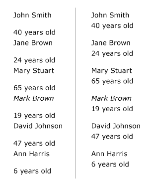
Left: How old is Mark Brown? Added vertical space “chunks” the list, so readers don’t have to organize the information themselves. Right: Wait a minute… How old is Mark Brown? When you change vertical spacing, you change the way people read information. Vertical spacing can be used to enlighten or confuse the reader. So… how old is Mark Brown?
Basic Separation: The Paragraph
A paragraph is a self-contained point or idea. Yet paragraphs support each other by describing something, advancing a plot, or developing an argument. As a result, paragraphs need to be visually separate from one another but still read as belonging together.
Good online paragraph spacing is 66 to 75 percent of the line height. For example, if your line height is 18px, a good paragraph spacing is 12px (18 x .66) to 14px (18 x .75, rounded up).
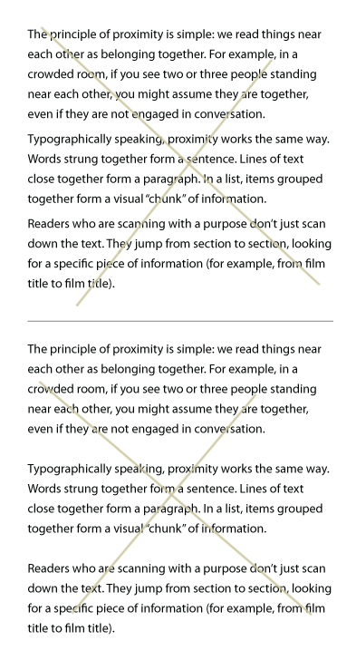
The two margin-bottoms shown below are incorrect. The top one is set at only 25 percent of the line height. The paragraph spacing is too tight; the paragraphs start to blend together. The bottom one is set at 100 percent of the line height. The paragraph spacing is too loose; the paragraphs start to float away from each other.

Top: When spacing is too tight (25% of line-height), paragraphs blend together. Bottom: When spacing is too loose (100% of line-height), paragraphs float away from each other.
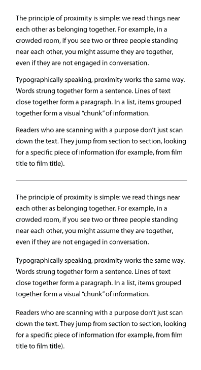
The two margin-bottoms shown below are better. The top one is set at 50 percent of the line height. This paragraph spacing works well on the printed on the page, but it’s a hair tight for chunking text on the screen. Especially if readers need to scroll through the text.
The bottom one is set at 66 percent of the line height. The paragraph spacing looks good, with enough space to properly chunk the text. You can set paragraph spacing up to 75 percent of the line-height if a looser spacing works better with your font and your text.

Top: 50% paragraph spacing looks pretty good in print. It might look a little too tight on your screen, especially if readers need to scroll through your text. Bottom: paragraph spacing set at 66% of the line height works better.
Create a System of Vertical Spacing
Long or complex texts need a system of vertical spacing. In the resume, each section has multiple elements that need to be separate from each other, yet grouped together for that section. For example, the various jobs need to be separate from each other. But employer, dates, job title, and job description need to be grouped together.
To further complicate the matter, information must be “chunked” into sections—so potential employers can jump around the text as needed.
When building a system of vertical spacing, start with the line height. Make sure lines of text are properly spaced. Next, consider the elements in the basic chunk (for example, paragraph). How much space do they need to feel separate, yet related? Move out from the basic chunk using increasingly larger spaces to create each level of chunking.
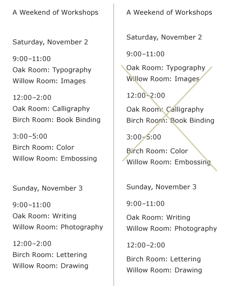
To promote rhythm and tension, try to compose systems of vertical spacing around a mathematical constant. This will help you create spaces that are dissimilar (for contrast), yet have a visual relationship. The “Weekend of Workshops” list below has a 20px line height. Vertical spaces used in the example include 5px, 10px, 25px, and 35px. All spaces, including the line height, are divisible by 5.

Use as many levels of vertical spacing as the text needs. No more, no less. Left: This system uses two levels of vertical spacing (10px, 35px) with a lot of contrast. Right: A system with three levels (5px, 10px, 25px) and less contrast makes it harder to see the “chunks.”
You don’t always have to use a mathematical scale when designing a page. But it’s a good place to start!
Note: you might have heard that all web typographers should use a baseline scale, so all lines of type (regardless of number of columns, number of headings) line up on their baseline. This is another approach to creating a vertical scale. Personally, I find my work is better if I don’t force type into a baseline scale… I let the vertical spaces develop organically. Neither way is right or wrong. It’s a matter of personal preference.
Using Rule Lines
Rule lines are powerful symbols of separation. They are horizontal slices in the vertical flow of the text. The more subtle the line, the better. Use the lightest weight (1 pixel) possible, or de-emphasize it with a duller or lighter color (or a shade of gray). Sometimes your text will demand more powerful rule lines, but don’t make them more powerful than needed.
Use the principle of proximity. Rule lines should be closer to the information they belong with.

Left: A good rule line is closer to the “chunk” it starts or ends. It is as subtle as possible. Right: A less successful rule line is too obvious, and is not connected with either “chunk” of information. It hinders the reader’s vertical scanning.
Use the principle of similarity. If two rule lines symbolize the same thing (start a new section), they need to look alike. If you need or want to use rule lines to mean two different things (start a new section, separate the footer from the text), then they need to be different. Rule lines should help clarify information for the reader, not create confusion.
Rule lines help chunk information, but don’t let them become a crutch; you’ll use them too much and undermine the hierarchy. Make the hierarchy and vertical spacing work first, then add rule lines where they’ll serve the text.
Quick Tips
When creating vertical spacing, remember…
- We read things that are near each other as belonging together.
- The smaller the space between items, the more the items feel like they belong together.
- The larger the space between items, the more the items feel separate from each other.
- Paragraph space (margin-bottom) should be 66 to 75 percent of line height.
- Use as many levels of vertical spacing as the text needs—no more, no less.
- Try building a system of vertical spacing using a mathematical scale. If the line height is 18px, other vertical spaces in the system might be 6, 12, 24, and 36px (all are divisible by 6).
- Chunking needs contrast. A system of vertical spacing with spaces that are too similar won’t help readers.
- Rule lines should be as subtle as possible for the purpose they serve, and close to the chunk they are beginning or ending.
- Rule lines with a similar purpose should look alike. Rule lines with different purposes should not look alike.