Overview of the Assignment
In this exercise you create a system of vertical spacing to chunk text and help potential employers scan Jamie Peterson’s resume.
- If possible, print out the resume you built in the last exercise (or take a screen shot).
- Identify what text should be grouped together, and then what groups need to be grouped together into a larger section.
- Create a vertical spacing system based on the text’s line height.
- Make a copy of the resume folder from the last exercise. Rename it resume_spacing. Rename your CSS file resume_spacing.css, and link to it.
- Apply the vertical spacing system, paying attention to where spaces need to increase or decrease. It’s OK to deviate from a mathematical system if it works better.
- Keep an eye on hierarchy. Adding the vertical spacing increases/decreases emphasis depending on how things are grouped. You might need to make changes to hierarchy.
- Follow the walk-through provided. Read what a typographer looks for in the process.
Get Started
Identify Levels of Grouping (Chunking)
Always start by analyzing the text you’re working with. Know what text needs to be grouped together, and what items need more space. This helps “chunk” the text for easier scanning.
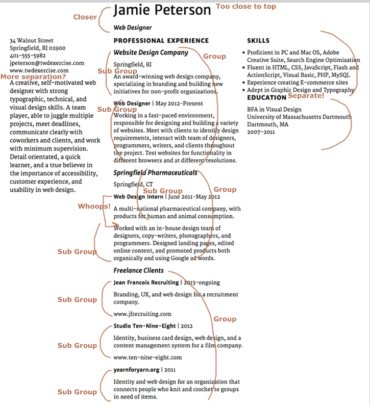
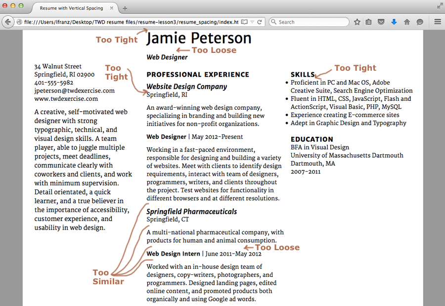
Mark up a screenshot of the resume so far. What needs to be grouped together? What spaces need to increase? What spaces need to decrease?
Start the Page
Create the Lesson Folder
In this exercise, you’ll modify the resume you set up in the last lesson, so make a copy of the resume_hierarchy folder and name the new folder resume_spacing. Keep it in your web_typography folder.
Set Up Your Files
Rename the CSS file resume_spacing.css. Link it to the index.html file by going into the HTML file and changing the syntax in the head element to the following:
<link href="resume_spacing.css" rel="stylesheet" type="text/css">
Change the title to
<title>Resume with Vertical Spacing</title>
Determine and Apply Your Vertical Spacing Scale
You’ve already marked up what needs to be grouped together and where to add space. Now it’s time to implement those decisions.
Build a Scale Based on Your Line Height
In my version of Jamie Peterson’s resume, my text has a line height of 20px. So I’ll start with a scale that includes numbers mathematically related to 20 (e.g., 2, 4, 5, 10, 20).
What if I was using a different font, and my best line height for the content was 19px? Nineteen is a prime number, which makes it hard to compose a mathematical scale. I could set spacing at 9.5px or 4.25px, which would work in theory, but browsers round decimals up or down to the next pixel, so it’s better to use whole numbers.
I would not change the line height. If I’ve determined 19 is the best line height for comfortably reading the text, I don’t want to compromise it. I would keep my line height as is, but round up and use 20px as my basic number for the vertical spacing system. If the system seems too loose, I’d round down, and use 18px as my basic number and recalculate the scale.
Using a base measurement of 20px, and knowing that I need a lot of contrast between different kinds of vertical spacing, I’ll start with the following scale:
- 20px between the main sections (h2: Professional, Skills, Education)
- 10px between groupings within those sections (h3: two companies, freelance work)
- 5 px for any mini spaces I might need.
Remove Existing Vertical Spacing on Text
When applying a new scale, the first thing you need to do is remove any top or bottom padding you’ve applied to text.
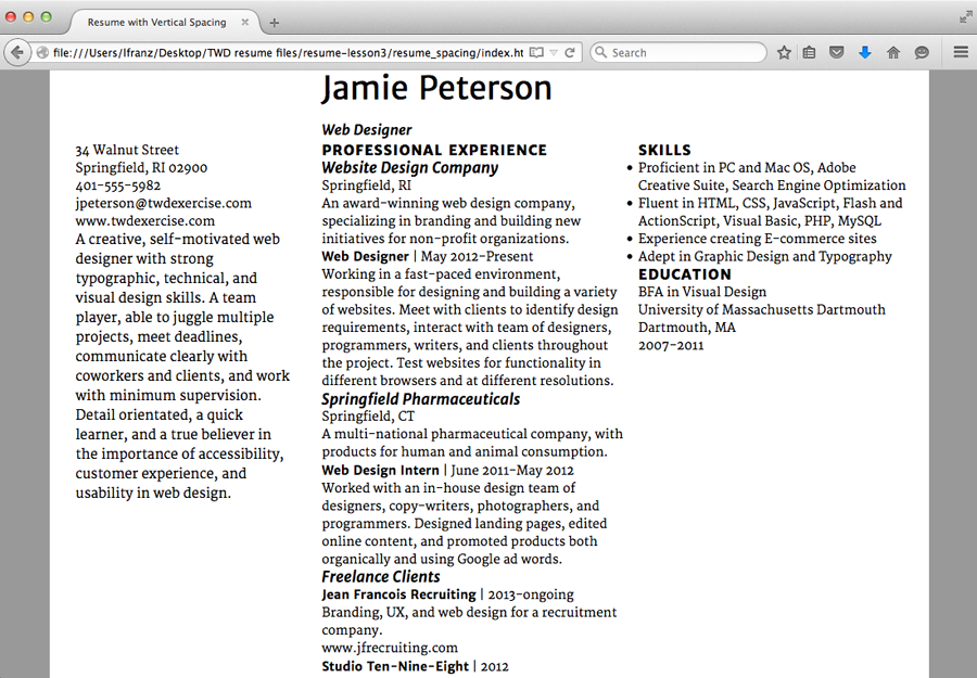
I’ve removed the bottom padding I was using on the h1, h2, h3, and p elements. I also fixed an error in the text. Now I’m ready to start applying a new system of vertical spacing.
A note about mobile first: I personally find it easier to explain good vertical spacing when I can show the relationship between all the elements at once. So I’ll be showing the laptop size browser when making decisions. I’ll set my styling in the first portion of my CSS (not in a media query). If I need to make changes, I’ll do it at the end of the exercise.
Start Applying the Vertical Space Scale
For my scale I’m using 20px top margin on the h2, 15px top margin on the h3, and 12px bottom margin on the p elements. My CSS looks like this:
h2{
  font-family:'Merriweather Sans', verdana;
  font-size:16px;
  line-height:20px;
  font-weight:800;
  text-transform:uppercase;
  letter-spacing:1px;
  margin-top:20px;
  }

h3{
  font-family:'Merriweather Sans', verdana;
  font-size:17px;
  line-height:20px;
  font-style:italic;
  margin-top:10px;
  }
p{
  font-family:'Merriweather', georgia;
  font-size:14px;
  line-height:20px;
  margin-bottom:12px;
  }
But wait! I just told you to remove the bottom padding, and I’m having you add the space back in as top and bottom margins!
Why? Collapsing margins.
Understanding Collapsing Margins
When an element with a margin-bottom (e.g., my p has a 12px bottom margin) is above an element with a margin-top (e.g., my h3 has a 10px top margin), the margins collapse, using the larger of the two values.
This is great for web typographers! When you establish a vertical spacing system, you don’t have think about the space between two differently set elements. For example, my p element sits above an h3 element in my Professional Experience column. Together, they will not have a 22px space between them. The margins will collapse, and the space will be the larger of the two: 12px.
Just set the margins as you want them, and the browser will do the work for you (collapsing the margins so only the bigger margin is used).
View Your Page
After you’ve added your h2, h3, and p vertical spacing, take a look at the results. How is it working? Do you need to change anything?
I’m finding a couple of problems with mine.
Finesse the Vertical Spacing
Your layout probably has different spacing issues. But here’s how I’ll fix mine. Most of the fixes are pretty easy. They use skills you’ve used in previous exercises.
- My h2 needs more space under it. I add a 5px mini space as a bottom margin on the h2.
- My h3 needs more space under it. I add a 5px mini space as a bottom margin on the h3.
- The space above my h2 needs more contrast to the space below the p elements. I change the bottom margin on the p to 10px, and change the top margin on the h2 to 15px.
- I want the “title | date” line closer to the description after it. I create a class called “job-title”, give it a 5px bottom margin, and apply it to the <p></p> elements that contain the job title and date of each job.
- I need to fix the h1. Jamie Peterson’s name needs to be further from the top edge. I add a 40px top margin to the h1.
Understanding Line Height
The last fix is more complicated.
- I need to fix the h1. I want less space above “Web Designer.”
I’m not using any margins or padding between “Jamie Peterson” and “Web Designer.” Why is there so much space? The only vertical space I’m using is line height. I need to change the line height.
Line height is different from leading (the term used in print typography). Leading is added below a line of text. Line height puts half the space above a line of text… and the other half below a line of text.
To determine the amount of space the line height adds above and below a line of text, take the size of the line-height, subtract the size of the text, and divide by two.
For example: The line height on “Jamie Peterson” is 40px. The text size is 36px. 40-36 = 4px. 4px/2 = 2px. There is 2px of space above and below the name. The line height on “Web Designer” is 20px. The text size is 16px. The space above and below the words “Web Designer” should also be 2px. (20 minus 16 equals 4 then divide by 2).
But it’s not.
In the image below, you can see the problem. On the left, there should only be 4px of space between the two (2px below Jamie’s name plus 2px above “Web Designer”). But there is a lot more space than expected. On the right, Jamie’s name and “Web Designer” have the same line height (40px). There is no change in the amount of space between the two lines of text. Why?
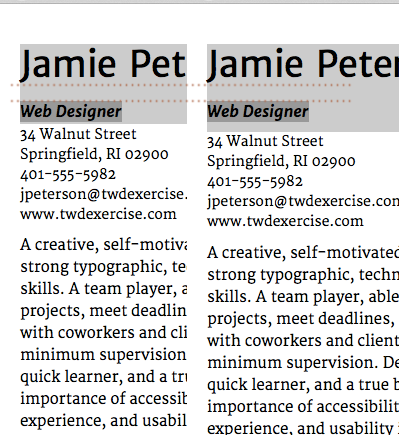
Left: “Web Designer” has a line height of 20px. Right: “Web Designer” has a line height of 40px. The space between Jamie Peterson and “Web Designer” doesn’t change.
“Web Designer” is part of the h1. It continues to recognize 40px as the line height before the class (to make “Web Designer” look different) is applied. Thus “Web Designer” has 12px (40px minus 16px, then divided by 2) space above it. Once the class is applied, the new line height is recognized, and “Web Designer only has 2px space… below it.
If I change the line height on “Web Designer” to 40px, you can see the amount of space above “Web Designer” doesn’t change. Only the space below it changes. In both instances “Web Designer” is using 40px line height to determine the spacing above the text.
OK. But What’s the solution? It depends on your goal. If you want all of your text to line up on a perfect baseline grid, you’ll need to do some math. Since I’m not a fan of the baseline grid, I’ll just remove the line height on the .web-designer class, and set my overall line height for the h1 to a number that is smaller than 40px. I’ll try 30px.
View Your Page
After you’ve finessed your vertical spacing, take a look at the results. How is it working? Do you need to change anything?
I’m still finding problems with mine.
- Now that the type is almost done, I think I want the professional statement before the contact information. I want employers to see Jamie’s strengths immediately.
- The space between the h2 and h3 looks good (15px). But that same space between the p and the h3 (15px) looks too tight.
- The freelance work isn’t in clear chunks yet. I think the problem might be the urls.
- The resume looks cut off at the bottom. There isn’t enough vertical space to say, “hey, this is the end of the page.”
- I’d like the three columns to line up on a horizontal line. It will look cleaner, and Jamie’s name will stand out more.
Be Willing to Make Changes
Good, simple typography looks effortless. But it’s not. Here’s how I fix my type:
- I want the professional statement before the contact information. I make this change in the HTML.
- Some of the h3s don’t have enough space above them. I change the top margin on my h3 to 20px. This might work.
- The urls under “freelance work” are not chunked to anything. In the HTML, I change this by putting them in the same paragraph as the project description text (no longer in their own <p></p> tags).
- There isn’t enough vertical space at the bottom of the page. I add 20px bottom padding on the main_container.
- I’d like the three columns to line up on a horizontal line. The Professional column and the Skills column look lower because the h2 has a top margin of 20px. If I add a top margin of 20px to my .statement class (now at the top of the Contact column), everything should line up.
View Your Page
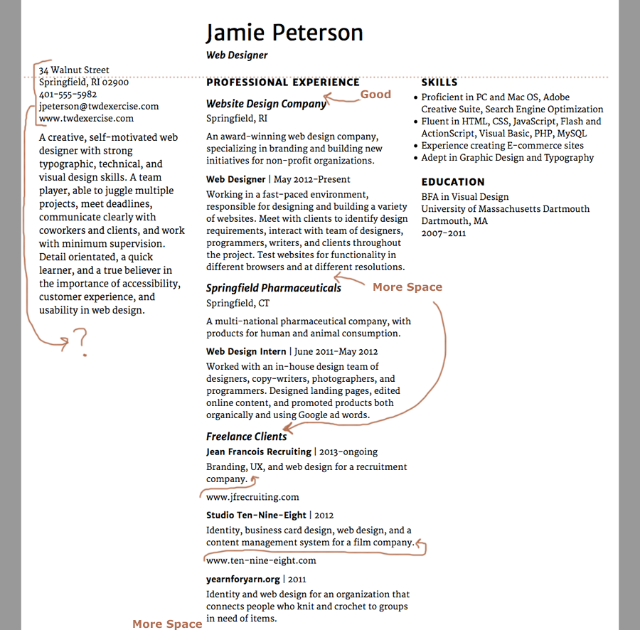
After you’ve made changes, take a look at the results. How is it working? Do you need to change anything else? I do!
- The professional statement doesn’t look like it’s lined up with the other two columns. This might be because it has lowercase letters. It might be because it has a 22px line height, while the h2 has a 20px line height. Either way, I need to nudge it up a hair.
- The spaces above and below “Professional Experience” are too similar. This ruins the chunking. Professional Experience looks like it’s just floating there in the center.
- I increased the h3 a while ago. I did not increase “Web Designer.” I want them to match.
- The items in the Skills list are too dense. They could use a little spacing between each item. Maybe the 5px mini space?
- I’ve moved all the other dates onto a line with other information. I have only one date that doesn’t follow the system. I should fix that.
- I need a bit more space at the bottom of the main container.
- I’d like more separation between the professional statement and the contact info. I might even try a subtle rule line here.
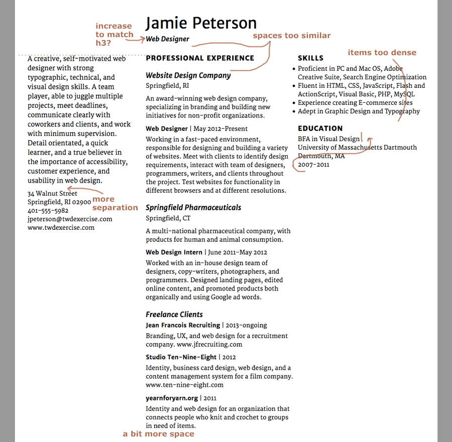
I’m hoping this is the last batch of spacing problems. I’ll take a deep breath, and tackle them one at a time.
Fingers Crossed, These are the Last Changes
Good, simple typography looks effortless. But it’s not. I know.
Once again, your layout probably has different spacing issues. But here’s how I’ll fix mine. The first six are pretty easy.
- I need to nudge the professional statement up a hair. To fix this, I made the top margin on the class .statement 19px (1px smaller).
- The spaces above and below “Professional Experience” are too similar. To fix this, I added a bottom padding of 10px to the h1. Note: I didn’t change the h3, because I didn’t want all the h3s to change.
- I need to increase “Web Designer” to match the h3. To fix this, I increased the class .web-designer 1px to 17px.
- The items in the Skills list need a little space between them. To fix this, I added a 5px margin bottom to the li (list item) in the CSS.
- I have one date that doesn’t follow the current system. I fixed it by moving the dates Jamie attended UMass Dartmouth up next to the degree, and separated them with a pipe.
- I need more space at the bottom of the page. I fixed it by changing the bottom padding on the main container to 40px.
Adding a Rule Line
The last fix is a bit more complicated.
- I’d like more separation between the professional statement and the contact info. I might even try a subtle rule line here.
Think of a rule line as a border on only one side of the element. I want a line between the professional statement and the contact info. I can think of it either as border at the bottom of the professional statement, or as a border at the top of the contact info.
To help me decide which element to put the border on, I ask myself, “Why do I want to add this rule line?” My answer is, “So the contact info doesn’t get lost. Right now it feels like it’s part of the professional statement.”
I want to fix the contact info. So that’s where I’ll add the border.
To do this, I make a class called “.contact” in the CSS, and apply it to the <p></p> wrapping the contact info. Then I style the .contact class in the CSS like so:
.contact{
  border-top:1px solid #999999;
  margin-top: 15px;
  padding-top: 5px;
  }
Notes on my CSS:
- border-top tells the browser to only put a border line at the top of the element.
- You can style the border in a single line of syntax. But make sure you put a space between each variable. 1px tells the browser how thick the line should be. Solid tells the browser the line is a solid line. #999999 tells the browser what color the line is.
- I wanted more space above the contact info too. Margin-top adds space outside of the element (so it will be above the line). Padding-top adds space inside the element (so it will be between the line and the text). I used 15px and 5px because they add up to 20px (the line height I’m using for the text). I made the padding smaller than the margin, because the rule line should be closer to the text it belongs to.
Note: others might choose to add the border to the class “.statement” because it already exists. This is another way to approach it. Neither approach is completely wrong or right.
View Your Page
After you’ve made changes, take a look at the results. How is it working? Do you need to change anything else? I’m not completely happy with mine. I think “Professional Experience” is still floating a bit, and I’m not sure the chunking is resolved under freelance clients. But before I start noodling it any further, I should check how it’s working at a smaller browser width. Sometimes, changing the view can help me make better decisions.
Consider the Mobile View
So far, we’ve been looking at the page in a large browser, because I find it easier to explain good vertical spacing when I can show the relationship between all the elements at once. It’s time to take a look at the vertical spacing when it’s all in one single column.
When I look at my mobile view, some of the things I want to change won’t affect the larger browsers. Some of the changes will probably make the laptop view better. The top and bottom spaces (marked with an *) will definitely need to be change based on the browser.
- There is too much space above the h1, but only in the mobile view.
- The space above “Professional Experience” is too small. I think I can do this without it affecting the two and three column layouts.
- The space below “Professional Experience” is too big. I have the same problem at the laptop size. I don’t think I’ll need to set it differently in a media query.
- I want more space above the freelance clients in order to better chunk them from each other. I have the same problem at the laptop size. I don’t think I’ll need to set it differently in a media query.
- The space above skills is bigger than the space above education. I need to look into that.
- There is too much space at the bottom of the page, but only in the mobile view.
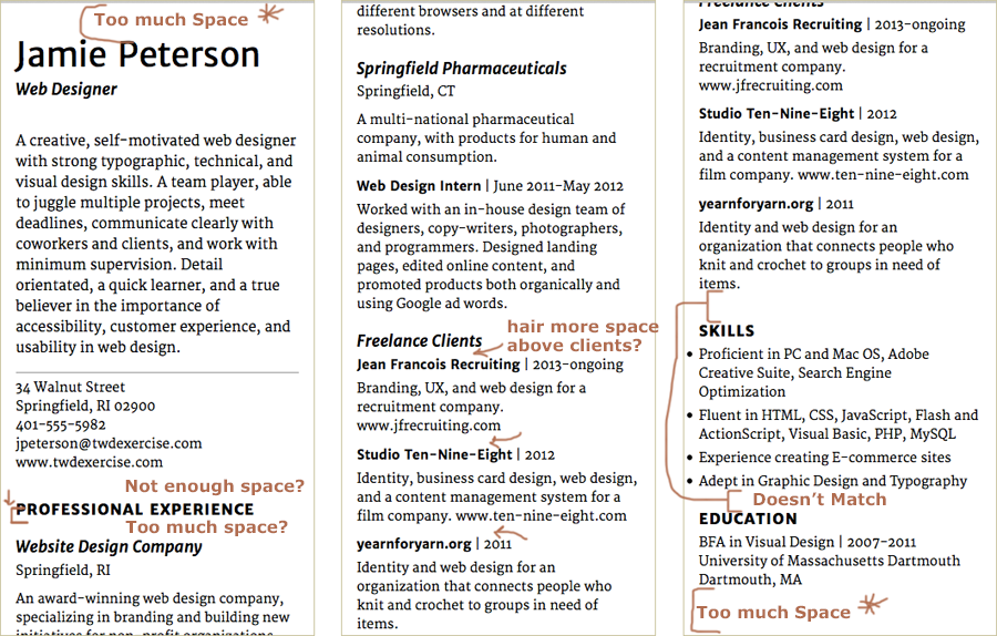
Most of these comments apply to all browser sizes. I expect only top and bottom spaces (marked with an *) will need to change for different browsers.
Fix the Vertical Spacing Across Browser Sizes
In this section I show some new approaches to using CSS. In each case, I also cover the simple fix. You do not have to use a more complex approach if you prefer to practice your basic CSS skills — confidence and independence are valuable.
Again, your layout probably has different spacing issues. But here’s how I’ll fix mine.
Fix Top & Bottom Spacing with a Media Query
I have too much space above the h1, but only in the mobile view. I fix this by adding an h1 to the very first media query (550px). and style the h1 with a margin-top:40px; because that’s the spacing I’ve been using so far and it that looks good on larger browsers.
Then I go back to the mobile styling (at the top of the CSS), and change the margin-top on the h1 to 20px.
I also have too much space at the bottom of the page, but only in the mobile view. I fix this the same way, except the bottom space is associated with my main_container. So I add a main_container to the very first media query (550px). and style it with a padding-bottom:40px; because that’s the spacing I’ve been using so far and it that looks good on larger browsers.
Then I go back to the mobile styling (at the top of the CSS), and change the bottom-margin on the main_container to 20px.
Since I’m working between media queries (which are a bit more complex), I make sure to view my web page at various sizes before moving on.
Fix Space Above “Professional Experience” in Mobile View
I don’t have enough space above “Professional Experience,” but only in the mobile view. I can fix this without affecting the two and three column layouts. The trick is to add the space to the bottom of the contact information (which is at the bottom of a separate column). When all the divs are in a single column, there will be more space above “Professional Experience.” As soon as the layout shifts to two columns, that extra space is no longer visible.
In my CSS, I add a margin-bottom:20px; to my “.contact” class styling. And I make sure to view my web page at various sizes before moving on.
Combine Two Selectors (New CSS Skill)
The space below “Professional Experience” is too big. Since I have the same problem at the laptop size. I don’t think I’ll need to set it differently in a media query. I’ll make my changes directly into the CSS at the top of the page.
I have used three h3s on this page. But I only want one of them (the one that immediately follows the h2 “Professional Experience”) to change. I could fix this in one of two ways.
Easy Fix: One approach is to use a process you are already familiar with. Create a class, apply the class to the h3, and style the class with a smaller top margin. This is a perfectly good approach. Use this fix if you want to!
New CSS: Another approach involves combining two selectors. I’ll use this syntax in my CSS:
 h2+h3{
   margin-top:15px;
   }
What does this mean? The combination h2+h3 means, “any h3 that immediately follows an h2.” The rest of it means what it usually does, “has a top margin of 15px.”
You can use the plus sign to style any selector that immediately follows another specific selector. Once you get the hang of it, this approach is a bit easier, because you don’t have to go into the HTML and apply a class.
Again, I make sure to view my web page at various sizes before moving on.
Apply Multiple Classes to an Element (New CSS Skill)
I want more space above the freelance clients in order to chunk them better. I have the same problem at the laptop size. I don’t think I’ll need to set it differently in a media query.
The names of my freelance clients (bold, italic) are styled using <strong></strong>. But the spacing for the paragraph they’re in is controlled by the “.job-title” class I created. Theoretically, I could just add a top margin to that class.
But Jamie’s job titles at Website Design Company and Springfield Pharmaceuticals are controlled by the same class. And I do not want to add space above those two job titles.
I can create another class, style it with the top margin I need, and apply it only to the paragraphs I want to add space to.
My CSS looks like this:
.freelance{
  margin-top:15px;
  }
And my HTML looks like this (new syntax in bold). Notice I applied more than one class to the p, each class is separated by a space:
<p class="job-title freelance"><strong>Studio Ten-Nine-Eight</strong> | 2012</p>
Use :last-child Selector (New CSS Skill)
The space above Skills is bigger than the space above Education. The bottom margin of the freelance paragraph and the top margin of Skills should collapse. But instead they are adding on to each other so the space is bigger than it should be. Why? Because Skills is at the top of a new div, the margins don’t collapse.
The trick is to remove the space below the last freelance paragraph. When the divs are in a single column, there will be less space. I want to keep the space above Skills, because it matches the space above Education. Also, when the layout shifts to three columns, Skills will continue to line up horizontally with Experience.
Easy Fix: One approach to remove the space is to use a process you are already familiar with. Create a class, apply the class to the last <p></p> under Freelance Clients, and style the class with margin-bottom:0. This is a perfectly good approach. Use it if you want to!
New CSS: Another approach involves identifying the last occurrence of a selector within a specific div. I’ll use this syntax in my CSS:
 #experience_column p:last-child{
    margin-bottom:0px;
    }
What does this mean? #experience_column p:last-child basically means, “The last p inside of the thing named experience_column.” The rest of it means what it usually does, “Has a bottom margin of 0px.”
You can use last-child to style any selector that is the last occurrence, whether it is inside another selector or not. Once you get the hang of it, this approach is a bit easier, because you don’t have to go into the HTML and apply a class. This is an advanced concept. If it makes you want to go screaming into the night, then please, create and apply a class.
Again, I make sure to view my web page at various sizes before moving on.
View Your Page
After you’ve made your changes, take a look at the results. How is it working? Do you need to change anything else? Mine is finally working! When you’re ready, move on to the next lesson.
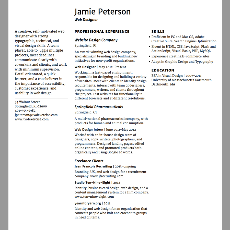
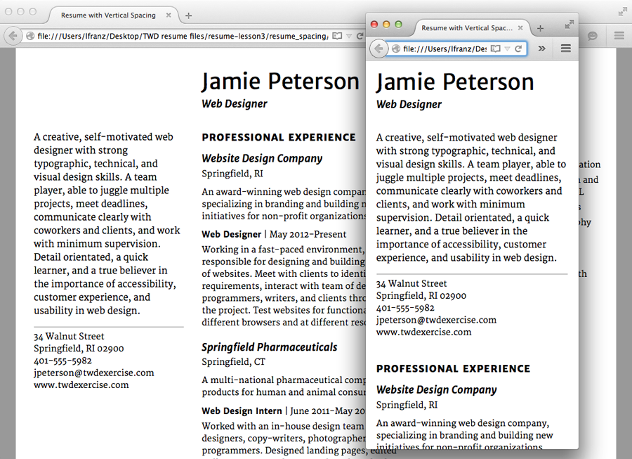
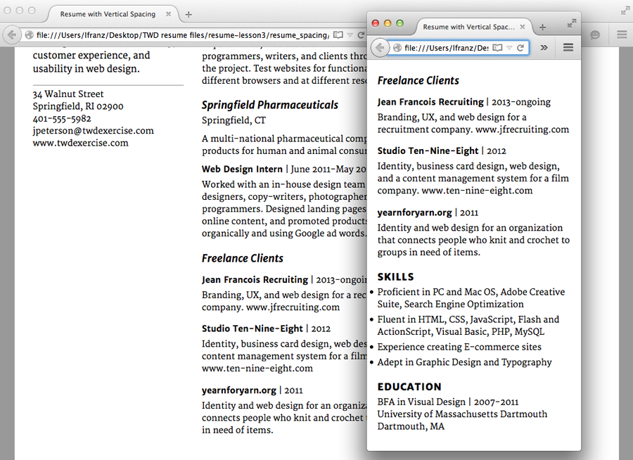 The vertical spacing works for both the laptop and mobile views. Finally!