Overview of the Assignment
In this exercise you design a web page with a resume on it. Start by setting text to promote reading a resume: establishing the most important information (for the mobile version) and setting the font, font size, line height, and measure (line length).
- Read the text you are setting (Jamie Peterson’s resume), so you are familiar with what information people will be skimming and/or reading.
- Identify what is the most important information — what needs to show up first on a small hand-held device?
- Choose a font (web safe or web font), font size, line height, and alignment to promote horizontal and vertical scanning.
- Set measure (column-width) based on the text, not the browser width.
- Build a responsive structure using multiple divs and media queries.
- Use comments to organize your HTML.
- Use the break tag and un-ordered lists to organize the information in the layout.
- Follow the walk-through provided. Read what a typographer looks for in the process.
Getting Started
Read the Text
Until now, you’ve started each assignment by creating a lesson folder. But as content gets more complex, you need to start by familiarizing yourself with the content. Download and read Jamie Peterson’s resume.
Think About How Someone Else Will Read the Text
Setting type on the web is a UX (user experience) issue. How would a potential employer or client read the text? They might scan over it, looking for key words and information. After reading various resumes, they might come back to the resume to look for Jamie’s contact information.
Reading the text and thinking about how someone else would read the text helps you identify how to order the information, what to emphasize, what to group together, and so on.
Sketch a Basic Structure
Web Designers Need to Sketch! Now is the perfect time to start. Get the ideas out of your head, and visualize possible solutions quickly and easily before building a layout. Writing syntax is easier when you know what your layout looks like.
Start with the mobile version first. Then do a laptop or desktop version. Designing from the two extremes will help you see problems (and find solutions) from the start.
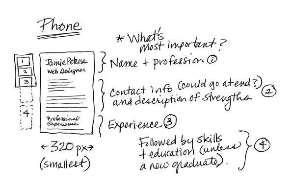
My sketch for the mobile device version of the resume. I’ve identified what needs to be at the top of the page, as well as what order I think the other information should follow.
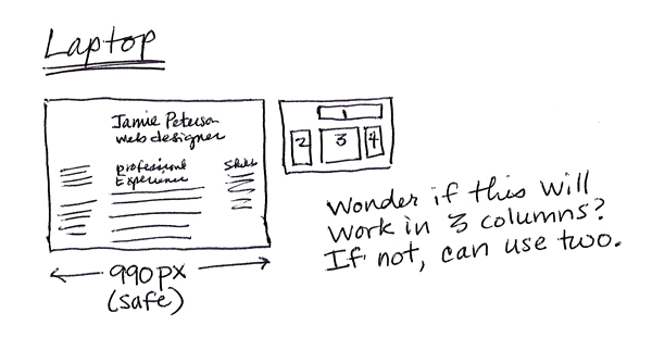
My sketch for a laptop version. I’ve identified where I think sections 1, 2, 3 and 4 should go in the layout. I’m not sure it will work, but it’s a good place to start.
Make a Mockup
Use the software you prefer to make your mock-up. You don’t have to learn a new application to do this exercise. Many of my colleagues prefer using PhotoShop. I prefer InDesign because I work quickly in it, can control the text more easily, and can export images when the mock-up is finished.
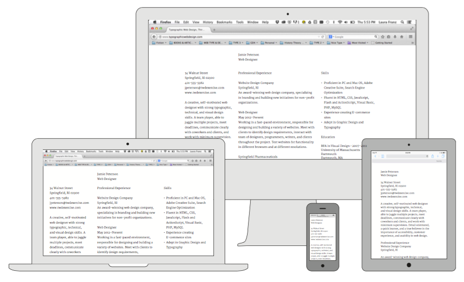
Below are my mock-ups for both the mobile and laptop versions. I’m working with Merriweather available from Google Fonts. You should use the font you want to use.
Notice I’m focusing on three things: a good font-size, line-height, and measure (line-length). This is enough to show me what my structure needs, and to tell me the three-column idea might not work. I really want a three-column layout, but am prepared to change it if I can’t make it work.
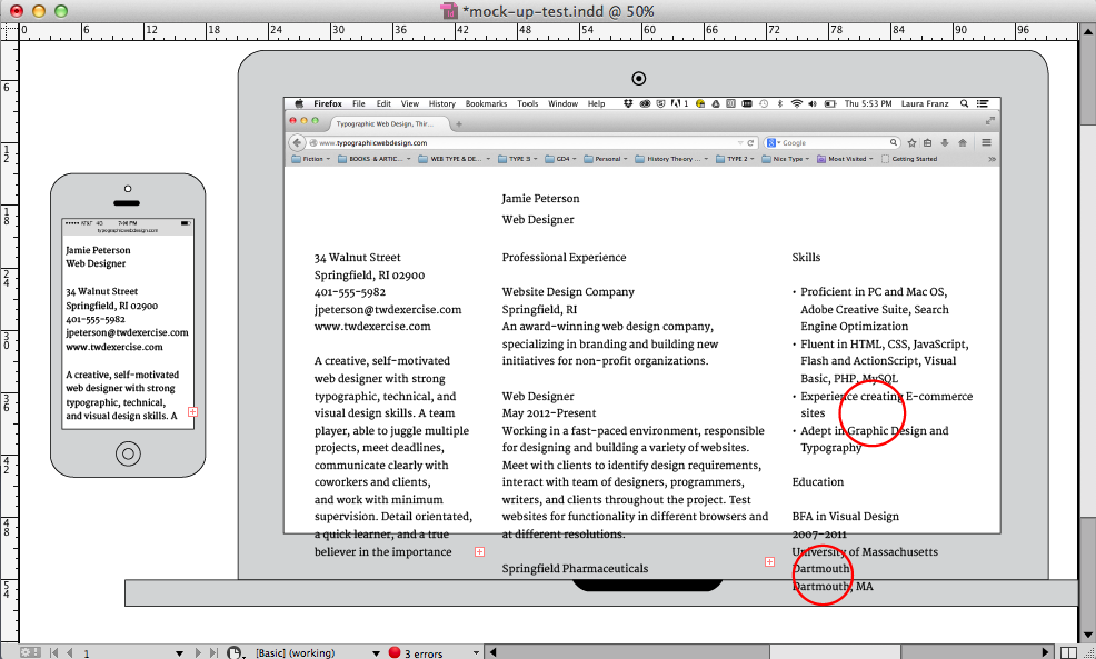
My three-column idea has two problems. One: an awkward ragged edge in the third column. Two: the name of the University splits onto two lines. This wouldn’t be a huge problem, but I don’t care for the repetition of the word Dartmouth. It looks a bit like a mistake.
Some Helpful Mockup Resources
- My mock-up_templates. (4 devices letter, 4 devices tabloid, phone/laptop only tabloid).
- how to download Google fonts to use in a mockup
Start Building the Page
Create the Lesson Folder
In your web_typography folder, create a folder for this lesson. Call it resume.
In the resume folder, create another folder called scripts. Put a copy of the respond.min.js file in the scripts folder (any time you design a responsive web page, you need this file).
Set Up Your HTML File
Since you are starting a whole new project, open your text editor, create a new document and save it as index.html in your resume folder.
You could type in the basic HTML syntax, as well as the respond.js, the conditional comment, and the viewport syntax. Or, you can copy and paste the syntax you need from your last exercise (responsive_layout) into your new HTML file. I personally use the copy/paste method. I make less typing mistakes that way.
Set up your basic HTML on your own, then compare your syntax to mine (below) to see if you have everything you need.
This is what my HTML syntax looks like:
<!DOCTYPE html>
<html>

<head>
<meta charset="utf-8">
<meta name="viewport" content="width=device-width">
 <title>TITLE GOES HERE</title>
 <link href="CSS-FILE-GOES-HERE.css" rel="stylesheet" type="text/css">
 <!--[if lt IE 9]>
 <script type="text/javascript" src="scripts/respond.min.js">
 </script>
 <![endif]-->
 </head>

<body>

</body>
</html>
Change the title in your HTML to:
<title>Resume</title>
Set Up and Link Your CSS File
Create a CSS file called resume.css. Zero out the margins and padding using the universal selector (*).
*{
margin:0;
padding:0;
}
Link it to the index.html file as usual by going into the HTML file and changing the syntax in the head element.
Start the Layout
- As usual, add your main_container div between the body tags, and describe the #main_container in the CSS. Give it a background color so you can see it as you build the layout.
- Inside the main_container, add any other divs you need. Style these divs in the CSS. You don’t have to put all the styling in at once! Take a guess at width, margin, and padding. Give them each a background color so you can see them as you build the layout.
- Type text inside your divs so they show up in the browser.
This is what my HTML content (what’s inside the body tags) looks like:
<div id="main_container>
  <div id="header">Name and Title</div>
  <div id="intro_column">Address and Intro</div>
  <div id="professional_column">Professional info</div>
  <div id="skills_column">Education and Skills</div>
</div>
View Your Web Page Frequently
If you make a mistake in your layout, it will be easier to find and fix if you view the page frequently. You’ll know the mistake was made within the last few changes.
Layout the Mobile View First
Always start building a layout from the mobile view, building up to the largest viewport. Since the mobile view styling lives at the top of the CSS, this will help you with your syntax!
Plus the mobile view tends to be easiest to lay out. You can add styling in your media queries as the layout gets more complicated.
Use the Float Property in Larger Views
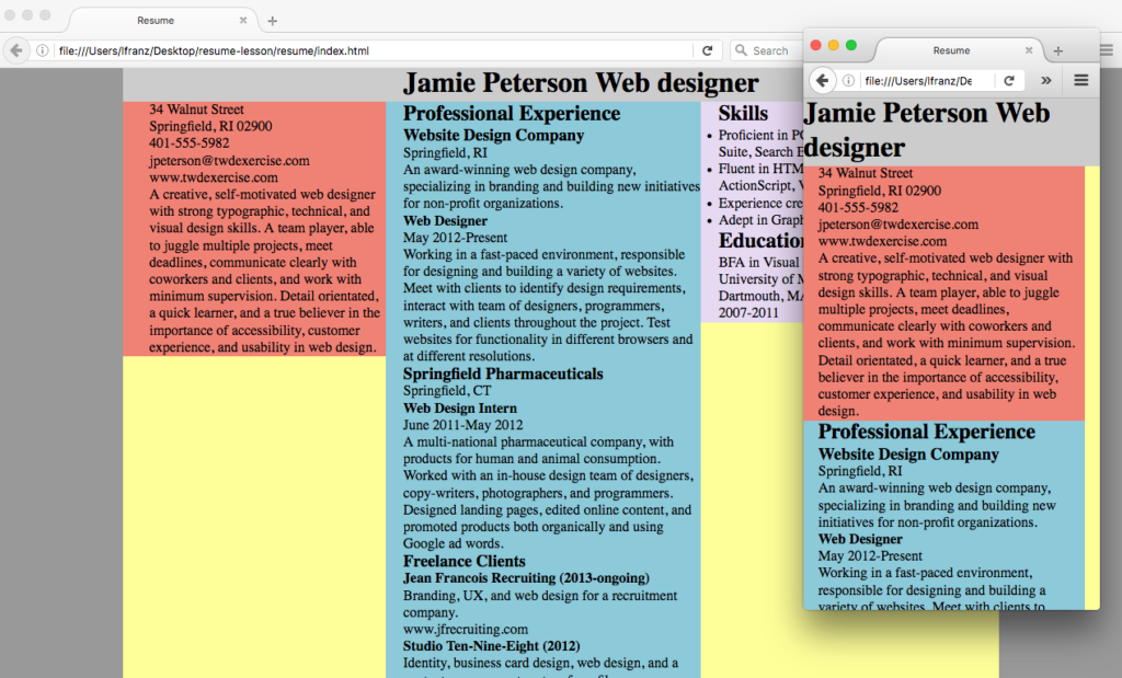
By default, your divs are block elements—they create a break (a new line) when you add them in. They show up in a single column. This is perfect for the mobile view.
In multi-column layouts, you can over-ride this default with the float property. Adding float:left; to each column will make them live side-by-side in the main_container.
If you want more information about the float property, Chris Coyner (CSS Tricks) provides a simple, yet thorough explanation in All About Floats.
Use Comments to Make Your HTML Easier to Work With
Ack! As you create more complex layouts, the text in your HTML documents can get really long. You can make notes or comments to help keep your syntax organized. In the example below, I use a comment to note what div is being closed. The comment syntax is in bold.
</div> <!-- Close the professional_experience_column -->
Add and Define the Content
- Put the content where it belongs, placing each bit of content into it’s appropriate div.
- Define the content. Which bit is the h1? h2? h3? Do you have any h4? Define the paragraphs as well. (I provide thoughts on the hierarchy system and notes on how to set a list below.)
Use the Break <br> Tag
You used the break tag in the Gallery X exercise when separating the date and location of exhibits. Another good place to use the break tag is in content like addresses. You want each line to break in a specific place, but the information as a whole is a paragraph (not a group of paragraphs). Thus, you can use the <br> tag like so:
<p>34 Walnut Street<br>
Springfield, RI 02900<br>
401-555-5982<br>
jpeterson@twdexercise.com<br>
www.twdexercise.com</p>
While you’d never use line breaks simply to make text fit a column better, here the <br> tag makes sense. Line breaks in an address are a meaningful part of the content.
Notes on the Hierarchy System
This content is more complex. It has multiple levels of hierarchy. For example, “Professional Experience” is a main section of the resume. It should be set as an <h2>.
The names of the companies Jamie worked for are also headings. Set them as <h3>. Finally, Jamie’s various position titles could be emphasized. I recommend setting them as <h4>.
“Freelance Clients” breaks the system. It belongs under the heading “Professional Experience” so it should not be set as an <h2>. But it’s not the name of an employer either. I decided to set it as an <h3>. This gives it the same level of importance as the employers. Then I set each freelance client as an <h4> like so:
<h3>Freelance Clients</h3>
<h4>Jean-François Recruiting (2013-ongoing)</h4>
<p>Branding, UX, and web design for a recruitment company.</p>
<p>www.jfrecruiting.com</p>

<h4>Studio Ten-Nine-Eight (2012)</h4>
<p>Identity, business card design, web design, and a content
management system for a film company.</p>
<p>www.ten-nine-eight.com</p>

<h4>yearnforyarn.org (2011)</h4>
<p>Identity and web design for an organization that connects
people who knit and crochet to groups in need of items.</p>
Under the “Skills” section is a list of skills. Lists are handled differently than paragraphs.
Define the List of Skills
The syntax for an ordered list (a list with numbers) is <ol></ol> or <ul></ul> for an un-ordered list (a list without numbers).
The syntax for a list item in either list is <li></li>.
Since the list of skills is not ordered, use the <ul></ul> tags around the text. Define each list item with the <li></li> tags, like so:
<ul>
<li>Proficient in PC and Mac OS, Adobe Creative Suite,
Search Engine Optimization</li>
<li>Fluent in HTML, CSS, JavaScript, Flash and ActionScript,
Visual Basic, PHP, MySQL</li>
<li>Experience creating E-commerce sites</li>
<li>Adept in Graphic Design and Typography</li>
</ul>
View Your Web Page
You’ve been viewing your web page all along. At this point you should have all of your columns in place (I have three columns and a header div). All content should be inside the appropriate column. Al headings, paragraphs, and lists should be set.
If you’re not familiar with HTML lists, notice the un-ordered lists have bullets by default.
Style the Text
Start With the Bulk of the Content
You might be tempted to start with the heading, because it comes first on the page. But since the bulk of the content on this page is text, start by styling the text. You need to make sure that works first. Then you can attend to styling headings that work with the text!
Generally, text should be set to 14–16px. I’ll set mine to 15px Merriweather. Merriweather has a large x-height, and a resume is not an article. If the text required sustained reading, I might make it a bit bigger.
Set your text (p) to the font and size that works for your design. Mine looks like this:
p{
    font-family:'Merriweather', georgia;
    font-size:15px;
    }
Line-height should be approximately 150% of the type size. I prefer to work with even numbers, so will try a line-height of 20px to start—set yours the way you want to (new syntax in bold):
p{
    font-family:'Merriweather', georgia;
    font-size:15px;
    line-height:20px;
    }
View your Web Page
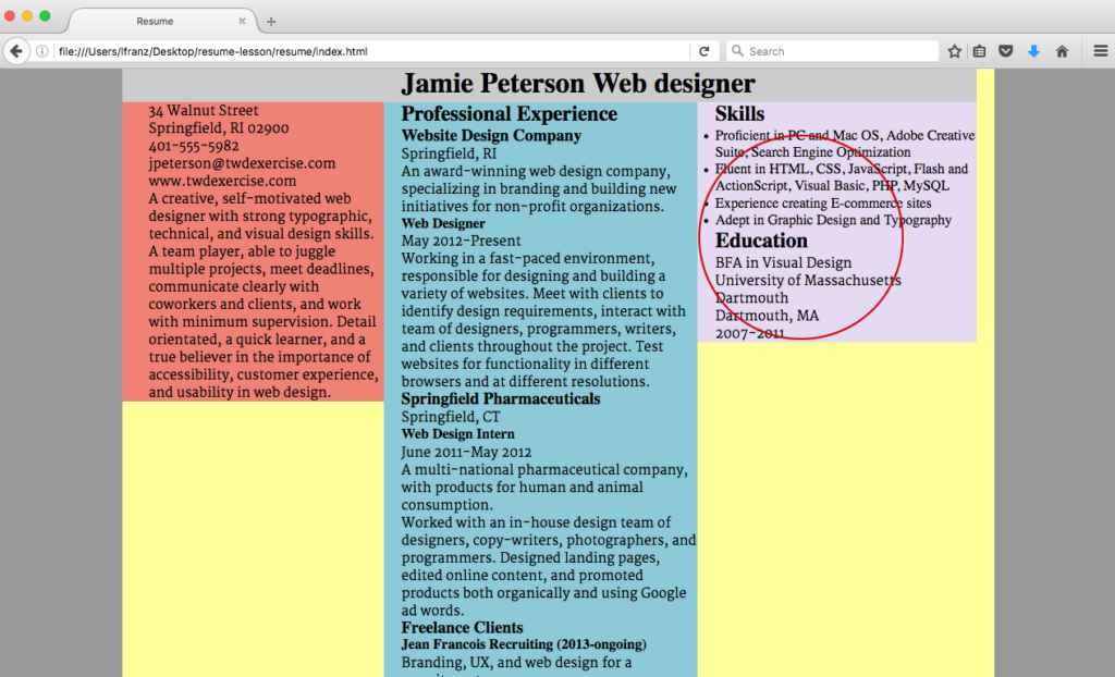
Look carefully at your p text. Mine is set at 15px / 20px (font-size:15px; / line-height:20px;) in Merriweather. It looks much bigger than the default 16px Times New Roman (see my list of skills). This tells me that I can afford to make the type a little smaller.
What does your text look like? Does it need to be bigger or smaller? Do you like the font you’ve chosen now that you see so much of it on the screen?
The larger x-height and loose letterspacing in Merriweather undermines the horizontal flow. So even though I’m going to make the text smaller, I’m not going to make the line-height smaller. It needs to feel more generous than it does here.
What does your line-height look like? Too tight? Too loose? Just right?
Make changes as needed.
View your Web Page
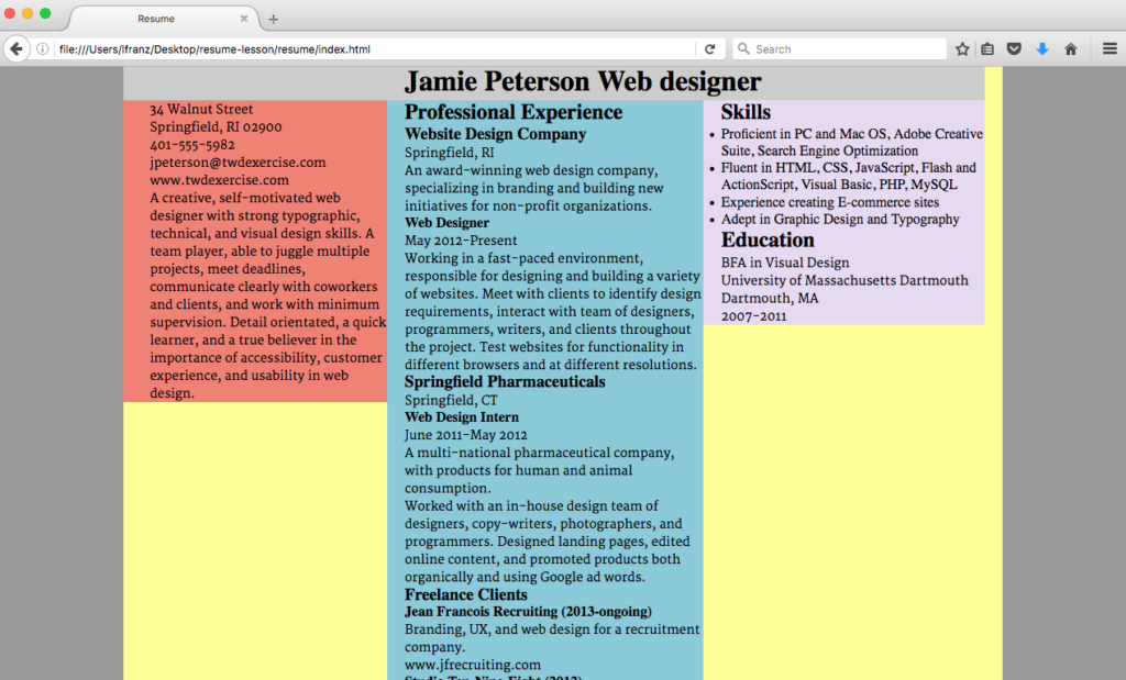
My type looks much better at 14px / 20px. And the ragged edge in the third column is looking better too. My three-column layout might work out!
The list is still set in Times New Roman though.
Style the List Items
In this project, I want the list items exactly the same as the text. To set the list items, describe the li element, like so:
li{
    font-family:'Merriweather', georgia;
    font-size:14px;
    line-height:20px;
    }
With the bulk of the text set to a good font, size, and line-height, it’s time to attend to line-length. Everything is crammed together though. It’s hard to see separate parts of the text because the margins and padding are set to 0.
Add Vertical Spacing Between the Paragraphs
Putting space between paragraphs helps readers scan text. I recommend using a space of at least 60% of the line-height. Since my line-height is 20px, I will use 12px for my paragraph space.
You explored margin and padding in the Gallery X exercise. Unless you’re doing something with background color, you can use either margin-bottom or padding-bottom to create space after paragraphs. I’ll use padding-bottom with the paragraphs, like so (new syntax in bold):
p{
    font-family:'Merriweather', georgia;
    font-size:14px;
    line-height:20px;
    padding-bottom:12px;
}
View your Web Page
The text has some vertical spacing. You’ll work on this later, but for now, it helps show where bits of text start and end. Which in turn, will help you look more closely at the measure.
Finding a Good Measure
A good measure (line length) is 45-75 characters per line. That’s a pretty wide range of characters. Robust paragraphs of text are often set with more characters per line, while “snippets” of text (similar to the kinds of text found in a resume) are often set with a narrower measure.
Why? Because resumes often have short lines (city, state / date / title) interspersed with the paragraphs. And the contrast between short lines of information and long lines of text can make a page look “bandy” (my highly-official word for “bands of space and text”).
Finding a good measure in this project will rely on creating acceptable ragged edges in the text. The ragged edge of text is influenced by the number of words that tend to fit on a line. Text with longer words in a narrow column will have a more ragged edge. You can “fix” a bad ragged edge by using a font with a narrower bowl (more words will fit on a line) or a smaller font-size (but make sure it’s still readable).
Of course, with a responsive layout, you have no control over the width of the browser. So your “fix” will not work for every reader. All you can do is your best.
Adjust Column Widths as Needed
Now that you have your text in place and set to a good font and size, you might need to change your column widths.
Consider the ragged edges and “bandiness” from your mobile version on up. Should a column be slightly wider or narrower? Should you add or remove a bit of space (padding-left) between any of the columns?
Modify Breakpoints as Needed
If you find yourself thinking, “I wish this layout changed when the browser was just a little narrower/wider” then modify the breakpoint! Breakpoints should be set based on what the layout needs. You can change a min-width so a change occurs at a different measurement.
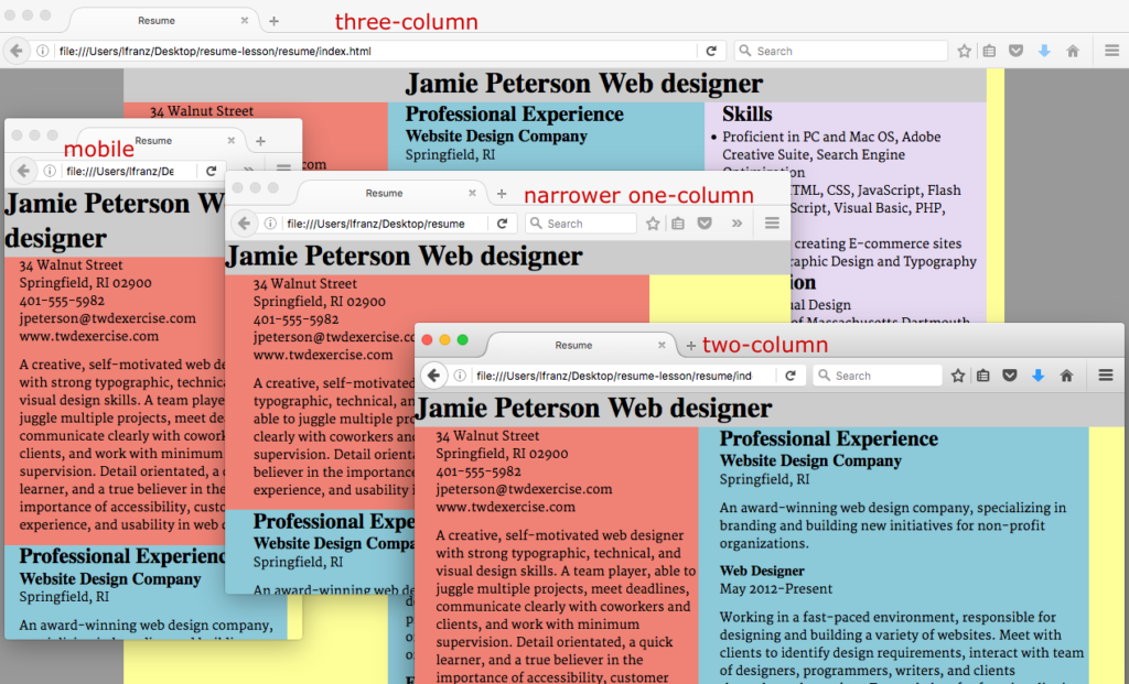
You can even add another breakpoint if you need to. I ended up with three breakpoints beyond the mobile view. 1] is a narrower single column, because the wide single column got too wide before browser got wide enough for two columns; 2] is a two-column with slightly different columns widths; 3] is a three-column layout.
Remove Extra Colors
Now that your structure is set and your measure is correct, you don’t need all the extra background colors. Remove them from your main_container, your header, and your columns.
Validate Your Files
Once everything else is done, don’t forget to validate your files!
Don’t worry if your layout is not beautiful, exciting, or unique. You will modify elements, paying attention to emphasis and spacing in the next couple of exercises.
You have only begun the process.
Recommended Resources
- To learn more about breakpoints, read “Logical Breakpoints For Your Responsive Design” by Vasilis van Gemert
Resources for This Project
- My mock-up_templates. (4 devices letter, 4 devices tabloid, phone/laptop only tabloid).
- how to download Google fonts to use in a mockup
